Components are the direction of front-end development, and the popular React and Vue are both component frameworks.
Google has been pushing for native components for browsers due to its mastery of the Chrome browser, namely the Web Components API. Compared to third-party frameworks, native components are simple and straightforward, intuitive, don’t have to load any external modules, and have a small amount of code. It is still evolving, but is already available for production environments.
The Web Components API has a lot of content, this article is not a comprehensive tutorial, just a simple demonstration to show how to use it to develop components.

1. Custom Elements
The following figure shows a user card
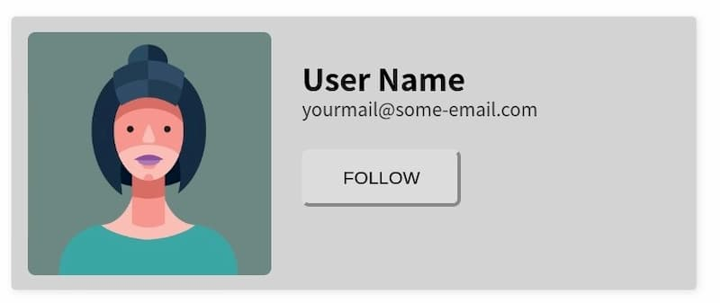
This article demonstrates how to take this card and write it as a Web Components component, and here is the final complete code.
The web page will display the user card as soon as the following code is inserted.
|
|
This custom HTML tag is called a custom element. According to the specification, the name of the custom element must contain a hyphen to distinguish it from the native HTML element. So, <user-card> cannot be written as <usercard>.
2. customElements.define()
Custom elements require a class to be defined using JavaScript, and all <user-card>s will be instances of this class.
In the above code, UserCard is the class of the custom element. Note that the parent class of this class is HTMLElement, and therefore inherits the features of the HTML element.
Next, use the browser’s native customElements.define() method to tell the browser that the <user-card> element is associated with this class.
|
|
3. Customizing the content of an element
The custom element <user-card> is currently empty, and the content of this element is given below in the class.
|
|
In the last line of the above code, the this of this.append() represents the custom element instance.
Once this step is done, the DOM structure inside the custom element has been generated.
<template>标签
Writing the DOM structure from the previous section using JavaScript is cumbersome. The Web Components API provides the <template> tag in which you can define the DOM using HTML.
Then, rewrite the custom element’s class to load <template> for the custom element.
In the above code, after getting the <template> node, all its children are cloned. This is because there may be multiple instances of the custom element, and this template will be left for other instances to use, so its children cannot be moved directly.
Up to this step, the complete code is as follows.
|
|
5. Add style
Custom elements don’t have styles yet, you can assign global styles to it, like the following.
However, the style of the component should be encapsulated with the code, taking effect only for custom elements and not affecting the external global style. So, you can write the styles inside <template>
|
|
In the code above, the :host pseudo-class inside the <template> style refers to the custom element itself.
6. Parameters for custom elements
The <user-card> content is now set inside <template>, change it to a parameter for ease of use.
The <template> code was revamped accordingly.
Finally, change the code of the class and add the parameters to the custom element.
|
|
7. Shadow DOM
We don’t want the user to be able to see the internal code of <user-card>, Web Component allows the internal code to be hidden, this is called Shadow DOM, i.e. this part of the DOM is isolated from the external DOM by default, no internal code can affect the external.
The this.attachShadow() method of a custom element enables the Shadow DOM, see the code below for details.
|
|
In the above code, the parameter { mode: 'closed' } of the this.attachShadow() method means that the Shadow DOM is closed and does not allow external access.
At this point, the Web Component component is complete and the full code can be found here. As you can see, the whole process is still very simple, unlike third-party frameworks that have complex API.
8 Component extensions
The components can be extended on the basis of the previous ones.
8.1 Interaction with users
The user card is a static component, and if you want to interact with the user, it is also very simple to listen to various events inside the class.
8.2 Packaging of components
In the above example, <template> is placed together with the web code, and it is actually possible to inject <template> into the web page using a script. This way, the JavaScript script and <template> can be encapsulated into a JS file, which becomes a standalone component file. The web page can use the <user-card> component by loading this script.
For more advanced uses of Web Components, you can continue with the following two articles.
9. Reference Links
- The anatomy of Web Components, Uday Hiwarale
Reference https://www.ruanyifeng.com/blog/2019/08/web_components.html