Nowadays, users’ requirements for front-end pages are no longer satisfied with achieving functionality, but also with value and fun. In addition to the overall UI aesthetics, adding the right animation effect in the right place is often more expressive and natural than static pages. For example, a simple loading animation or page switching effect can not only relieve the user’s waiting emotion, but even silently achieve the effect of brand promotion by using the brand logo and other forms.
React, a popular front-end development framework in recent years, proposes the concept of virtual DOM, in which all DOM changes occur on the virtual DOM first, and then analyze the actual changes of the web page through DOM diff and reflect them on the real DOM, thus greatly improving the web page performance. However, in terms of animation implementation, React as a framework does not directly provide animation effects to the components, and developers need to implement them themselves, while most traditional web animations are implemented by directly manipulating the actual DOM elements, which is obviously not advocated in React. So, how are animations implemented in React?
The essence of all animations is to continuously modify one or more properties of a DOM element to produce a coherent change, thus creating an animation. Animations in React are essentially the same as traditional web animations, but in two ways: through css3 animations and through js modifications to element properties. However, the implementation is more in line with the framework of React, and can be summarized in several categories
- interval animation based on timer or requestAnimationFrame(RAF).
- simple animations based on css3.
- the React animation plugin
CssTransitionGroup. - complex animations combined with hooks.
- other third-party animation libraries.
1. Timer or RAF based interval animation
In the beginning, animations were implemented by relying on timers setInterval, setTimeout or requestAnimationFrame (RAF) to directly modify the properties of DOM elements. Developers unfamiliar with React features may habitually get the real DOM node via ref or findDOMNode() and modify its style directly. However, fetching and manipulating the real DOM directly via ref is not recommended and should be avoided at all costs.
Therefore, we need to link methods such as timers or RAFs to DOM node properties via state. First, we need to extract the properties related to the changing style, replace them with state, and then add a timer or requestAnimationFrame to the appropriate lifecycle function to keep modifying state and trigger the component update to achieve the animation effect.
Demo
Take a progress bar as an example, the code is shown below.
|
|
In the example, we build the linear transition function animation in the increase and decrease functions, and requestAnimationFrame executes the transition function before each browser redraw, calculating the current progress bar width property and updating that state to make the progress bar re rendered again. The effect of this example is shown below.
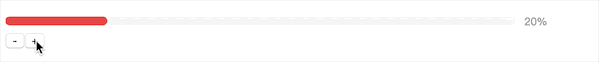
This implementation has good performance when using requestAnimationFrame, is fully implemented in pure js, does not depend on css, and may cause frame drops and lag when using the timer. In addition, it requires the developer to calculate the state based on the speed function itself, which is more complicated.
2. Simple animation based on css3
When animation and transition in css3 became available and widespread, we could easily use css to implement changes in element styles without having to calculate real-time styles artificially.
Demo
We still take the above progress bar as an example and use css3 to implement the dynamic effect of the progress bar, the code is shown below.
|
|
In the example, the increase and decrease functions no longer calculate width, but directly set the width after the increase or decrease. Note that the transition property is set in the css style to automatically achieve a dynamic change in the style when the width property changes, and to set the speed curve for different speed effects. The effect of the example is shown below. It can be found that, unlike the previous example, the progress data on the right side is directly changed to the target number without a specific change process, while the dynamic effect of the progress bar is more vivid because it is no longer a linear change.
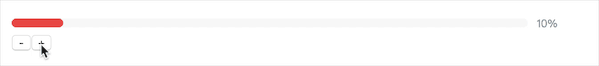
The css3-based implementation has higher performance and less code, but it only relies on css effects and is difficult to implement for complex animations. In addition, animating effects by modifying state can only work on nodes that already exist in the DOM tree. If you want to add entry and exit animations to a component in this way, you need to maintain at least two states to implement entry and exit animations, one state to control whether the element is displayed or not, and another state to control the properties of the element as it changes during the animation. In this case, the developer needs to spend a lot of effort to maintain the animation logic of the component, which is very complicated and tedious.
React animation plugin CssTransitionGroup
React has provided developers with an animation plugin react-addons-css-transition-group, which was later maintained by the community and became the current react-transition-group, which can easily implement the entrance and exit animations of components, but requires additional installation. react-transition-group contains CSSTransitionGroup and TransitionGroup, the latter is the underlying api, the former is a further encapsulation of the latter, which can be used to implement css animations more easily.
Demo
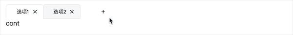
As an example of a dynamically increasing tab, the code is as follows.
|
|
|
|
The CSSTransitionGroup can add additional css classes to its child nodes, and then animate them with css animations for entry and exit. To animate each tab node, you need to wrap them in the CSSTransitionGroup component first. After setting the transitionName property to 'tabs-wrapper' and the transitionEnterTimeout to 400 milliseconds, once a new node is added to the CSSTransitionGroup, the new node will be added with the css class 'tabs- wrapper-enter' and then the css class 'tabs-wrapper-enter-active' is added on the next frame. After 400 milliseconds the css classes 'tabs-wrapper-enter' and 'tabs-wrapper-enter-active' will be removed simultaneously and the node completes the entire entry animation process. The implementation of the leave animation is similar to the enter animation, except that the added css classes are named 'tabs-wrapper-leave' and 'tabs-wrapper-leave-active'. The sample effect is shown in the following image.
The CSSTransitionGroup supports the following 7 properties.
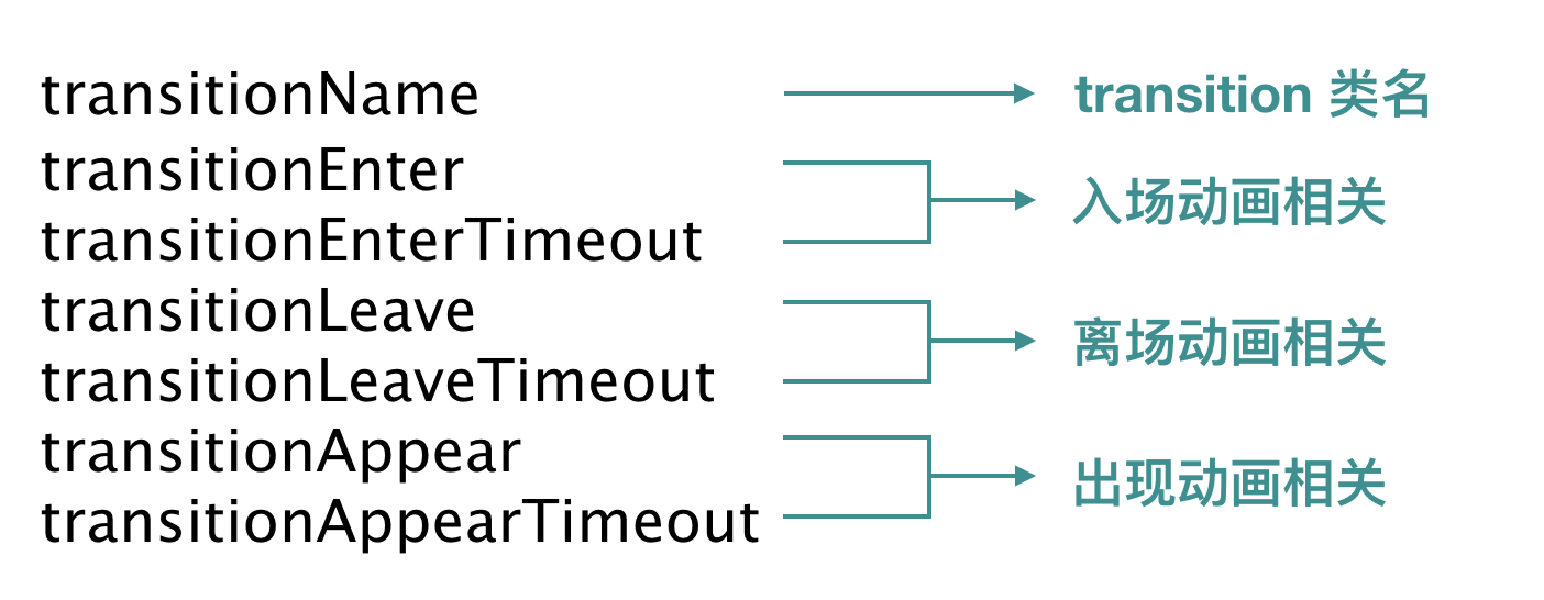
The entry and exit animations are enabled by default, and transitionEnterTimeout and transitionLeaveTimeout need to be set. It is worth noting that CSSTransitionGroup also provides an appearance animation (appear), which needs to be set to transitionAppearTimeout. So, what is the difference between the appear animation and the enter animation? When transitionAppear is set to true, the CSSTransitionGroup adds an appearance phase to the first rendering. During this phase, all existing children of CSSTransitionGroup are added to the css classes 'tabs-wrapper-appear' and 'tabs-wrapper-appear-active' one after the other to achieve the appearance animation effect. Therefore, appear animations only apply to the children of a CSSTransitionGroup that exist at initial rendering, and once the CSSTransitionGroup finishes rendering, its children can only have an enter animation, not an appear animation.
In addition, the following points need to be noted when using CSSTransitionGroup.
CSSTransitionGroupgenerates aspantag to wrap its children in the DOM tree by default; if you want to use other html tags, you can set thecomponentattribute ofCSSTransitionGroup.- The child elements of
CSSTransitionGroupmust have akeyvalue added to them in order to accurately calculate which nodes need to add entry animations and which nodes need to add exit animations when the nodes change. - the animation effect of
CSSTransitionGrouponly works on the direct child nodes, not on their grandchildren. - The end time of the animation is not based on the transition-duration in css, but on
transitionEnterTimeout,transitionLeaveTimeout,TransitionAppearTimeout, because in some cases transitionend events are not triggered, see MDN transitionend for details.
The advantages of implementing animations with CSSTransitionGroup are.
- simplicity and ease of use, allowing for easy and fast element entry and exit animations.
- Better performance in combination with React.
The disadvantages of CSSTransitionGroup are also obvious.
- Limited to appearance animations, entry animations and exit animations.
- Not flexible enough due to the need for a
transitionName. - Can only rely on css for simple animations.
4. Implementing complex animations in combination with hooks
In real projects, you may need some cooler animation effects, which are often difficult to achieve by relying on css3 alone. In this case, we may want to use some mature third-party libraries, such as jQuery or GASP, combined with the hook function of the lifecycle hook method in the React component, to achieve complex animations. In addition to the normal lifecycle of a React component, the underlying api TransitonGroup also provides a series of special lifecycle hook functions for its child elements, which can be combined with third-party animation libraries to achieve rich entrance and exit animations.
TransitonGroup provides the following six lifecycle hook functions respectively.
- componentWillAppear(callback)
- componentDidAppear()
- componentWillEnter(callback)
- componentDidEnter()
- componentWillLeave(callback)
- componentDidLeave()
They are triggered with the timing shown in the figure.

Demo
GASP is a flash-era animation library that has evolved since then, drawing on the concept of video frames, and is particularly well suited for long sequence animation effects. In this article, we use TransitonGroup and react-gsap-enhancer (an enhancement library that can apply GSAP to React) to complete an image gallery with the following code as follows.
|
|
In this example, we have added an entry animation enterAnim and an exit animation LeaveAnim to each subcomponent in the componentWillEnter and componentWillLeave hook functions of the subcomponent Photo. In the enter animation, we use TimeLineMax.from(target, duration, vars, delay) to create the timeline animation, specifying that the animation distance of each subcomponent decreases as id increases, the delay time increases as id increases, and the delay time of each subcomponent in the leave animation decreases as id increases. so that the animation effect is different according to the component id. In practice, you can add different effects to any subcomponent according to your needs. The effect of this example is shown in the following figure.
When using TransitionGroup, always call callback in the componentnWillAppear(callback) , componentnWillEntercallback) , componentnWillLeave(callback) functions after the callback at the end of the logic to ensure that the TransitionGroup correctly maintains the state sequence of the child nodes. For more details on the use of GASP, please refer to the official GASP documentation and the blog post GSAP, the professional Web animation library This article will not go into detail.
Combined with hook to implement animation can support a variety of complex animation, such as time series animation, etc., because of the reliance on third-party libraries, the animation effect is often more smooth, user experience is better. However, the introduction of third-party libraries requires developers to learn the corresponding api, which also improves the code complexity.
5. Other third-party animation libraries
In addition, there are many excellent third-party animation libraries, such as react-motion, Animated, velocity-react, etc., and each of these animation libraries is unique in its use.
5.1 Animated
Animated is a cross-platform animation library, compatible with React and React Native. Since during animation we only care about the initial state, end state and change function of the animation, and not the specific values of the element properties at each moment, Animated uses declarative animation, which computes the css object and passes in Animated.div to achieve the animation effect. So Animated uses declarative animation, which computes css objects by the specific methods it provides and passes in Animated.div to achieve the animation effect.
Demo
We use Animated to implement an image flip effect with the following code.
|
|
In this example, we want to achieve a 90° rotation of the image to the right with each click of the button. When the component is initialized, a new Animated object is created with an initial value of 0, this.state.anim. The Animated object has an interpolate function interpolate. When the input range inputRange and the output range outputRange are set, the interpolate function can perform linear interpolation based on the current value of the Animated object and calculate the corresponding mapped value.
In this example, we assume that the value of this.state.anim is increased by 1 for each click on the button, and the image needs to be rotated by 90°. In the render function, we set the interpolation function this.state.anim.interpolate to have an input interval of [0, 4] and an output interval of [‘0deg’, ‘360deg’]. When the animation is executed, the value of this.state.anim changes and the interpolation function calculates the rotation angle rotateDegree based on the current value of this.state.anim, which triggers the re-rendering of the component. Therefore, if the current value of Animated is 2, the corresponding rotation angle is 180deg. In the component rendering structure, you need to use Animated.div to wrap the animation node, and encapsulate rotateDegree as a css object and pass it into Animated.div as stlye to realize the change of the node’s css attribute of the node.
In the click event, considering that the button may be clicked several times in a row, we first use stopAnimation to stop the current animation, which returns a {value : number} object in the callback function, with the value corresponding to the last moment of the animation property value. Based on the obtained value value, the Animated.spring function is then used to start a new spring animation process, resulting in a smooth animation effect. Since we want the flip angle to be an integer multiple of 90° each time the rotation stops, we need to round the termination value of Animated.spring. We end up with the following effect:

The following points need to be noted when using it.
- The value of the
Animatedobject and its interpolation result can only be applied to theAnimated.divnode. interpolatewill linearly interpolate based on the input interval and output interval by default, if the input value is outside the input interval it will not be affected, the interpolation result will be interpolated outward based on the output interval by default, you can limit the interpolation result interval by setting theextrapolateproperty.
Animated does not directly modify the component state during animation, but directly modifies the element’s properties through its new object’s components and methods, without repeatedly triggering the render function.
6. Summary
When implementing animations in React, the first thing to consider is the ease of the animation and the usage scenario. For simple animations, css3 is preferred, followed by js-based interval animations. For element entry and exit animations, we recommend combining CSSTransitionGroup or TransitionGroup. When the animation effect to be achieved is more complex, try some good third-party libraries to open the door to wonderful dynamic effects.
Ps. All sample code in this article can be viewed at github
7. Reference
- react-transition-group
- react-gsap-enhancer
- A Comparison of Animation Technologies
- React Animations in Depth
Reference https://tech.youzan.com/react-animations/