The HTML <picture> element has been around for many years (it appeared in 2014), but it is rarely used, why?
I have summarized the following 3 reasons.
- no one knows about it
- cumbersome to use
- it can be replaced
This element is obviously very practical
The HTML <picture> element is useful, and is often used in conjunction with the <source> element (which can be multiple) and the <img> element (which can be up to one).
When rendering, the browser gives preference to the <source> element and the <img> element takes a back seat.
So the <picture> element is especially useful when we need to display different images in different scenes.
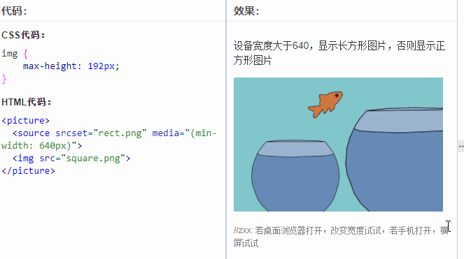
Different sizes show different pictures
This feature is often implemented using the HTML media attribute.
For example, there is the following HTML code.
If the width of the browser is less than 640 pixels, the positive direction picture is displayed, if the width of the browser is greater than 640px, a rectangular picture will be displayed, and the GIF recording screen is illustrated as follows.
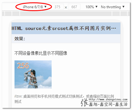
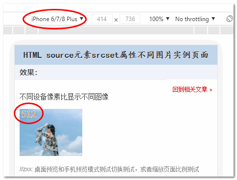
Different widths, different screen densities to display different pictures
This one uses the previously introduced srcset property to display different image resources depending on the image size (w descriptor), or device similarity ratio (x descriptor), e.g.
At this time, 1x screen shows 128px.jpg, 2x screen shows 256px.jpg, and 3x screen shows 512px.jpg.
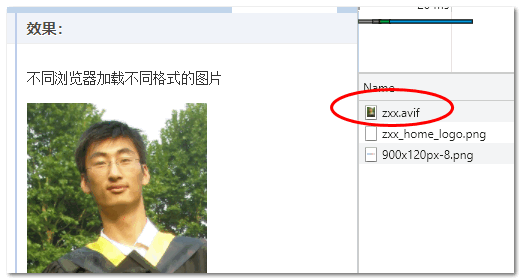
Different browsers display different suffix images
Let’s say there’s a new image format AVIF that’s more awesome than webP, Chrome already supports it, but other browsers don’t, and you want to use it, how can you do it?
The <picture> element can help, mainly by using the type attribute of the <source>element, as illustrated by the HTML code.
If the browser supports the AVIF format, the smallest AVIF format is loaded (size 47K), if the browser does not support the AVIF format but supports the WEBP format, zxx.webp is loaded (size 56K), if neither the AVIF nor WEBP image formats are currently supported by the browser, zxx.jpg is loaded with the <img> element in the bottom pocket (size 74K). jpg (74K in size).
Let’s say my Chrome browser version is 91, refreshing the demo page, I can see that zxx.avif is loaded, and the screenshot is as follows.
And my Firefox browser (90.0.2) loads zxx.webp:.
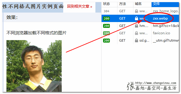
If you then use Internet Explorer to view it, it is 100% zxx.jpg.
Thus, the better the browser can be, the smaller the size of the image loaded, the better the experience.
But not many people use it
从上面案例可以看出,如果有不同场景显示不同图片的需求,<picture> 元素确实很实用,但是为什么日常项目开发很少见到前端开发者使用呢?
HTML is inherently disadvantageous and not many people know about it
In the field of front-end, books on HTML are almost a blank, because no one reads them.
Isn’t HTML just some tags?
I use Vue direct div can be done, the effect is still very good, there is nothing to learn.
It is very normal to have such a mentality. HTML is not function-related, but user-experience-related, and it is not easy for most developers to realize the function, so they don’t have the energy or motivation to pay attention to the detailed user-experience-related stuff.
Naturally, there is little concern about HTML, and fewer people care about it, so fewer people understand the <picture> element, and fewer articles are published about it, further leading to the fact that most front-end developers don’t know there is such an HTML element, and even if they know there is such an element, they don’t know what it is for.
Essentially, this is a business and market decision.
The problem of development costs
Whether a technology is popular or not depends not on how good it is, but on how easy it is to get started and how cheap it is to develop.
The biggest problem with the <picture> element is that we need to prepare multiple copies of the material, no matter what the scenario is.
Where do we get these multiple copies?
Do designers have to prepare multiple copies and developers have to prepare multiple copies?
These are human costs, simply not sustainable, even if the developers are very dedicated, dedicated time to do such a great thing, but the future maintenance of the people?100% how simple how to come.
What PC terminal mobile terminal, what 1x screen 2x screen, all 2x figure a shuttle, waste some traffic on the traffic chant, their performance and assessment and not related to this.
On the contrary, I developers spend time to distinguish between devices using different materials may lead to scheduling is too late, oh, that’s a big problem, this is the reality.
Of course, it’s best to use a tool to handle this.
Write a direct paragraph <img>, automatically extract the src address, use Node to convert the format, convert the size, etc.
But it’s still a hassle, and potentially a pain in the rear.
When Gulp was popular, PNG Sprite was very popular, I remember using a tool called spritesmith synthesis, directly throw PNG small icons, automatically merged into Sprite, CSS are generated for you, is not very cool?
Damn this thing is now screwed up.
To install Graphics Magick and Image Magick these two things, additional installation, outside of the project, and windows system these two things to install huge trouble.
Such a project handed over to the current newcomers to maintain, simply can not run up, will make people vomit blood.
Really, at the beginning directly on a PNG icon link on the good, now are http2.0, go all the CDN, more than a few requests are no matter.
Similarly, here, for different devices, width using different pictures, really, there is no need, unless the display is completely different-looking pictures, such as the PC side of the display is the cat, Mobile side of the display is the dog, such.
There are alternatives to the <picture> element
The <picture> element was designed with good intentions, but there are alternatives for every scenario it can address.
Let’s say different widths display different images.
If it’s a background image, it’s all CSS @media query in one sentence to get it done, real-time rendering response, easy maintenance, clean code, people love it.
If it’s an <img> image, CSS qualifies the size directly, then the object-fit property controls the display just fine, simple and easy, clean code, and people love it.
Let’s say different device densities display different images
Similarly, CSS Medias Query queries are supported, and if you have to use the <img>element to set it, you can just use an <img> element directly, no need to nest the <picture> element at all. The <img> element also supports the srcset attribute, and also supports the sizes attribute, w and x identifiers, which are very strong.
For example, in the end different browsers display different formats of images
In real projects, this is handled by the cloud service vendor, and usually COS services support configuring browsers like Chrome to display webp, and IE, Safari, etc. to display jpg.
It’s not like you have to go through the front-end, manually convert the image format one by one, and then wrap it up using the <picture> element.
It is all directly a src address to handle.
For example, in Tencent cloud directly a button to open it, screenshots show.
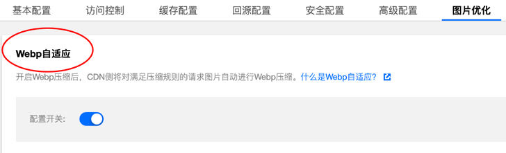
The avif adaptive option will probably be available soon.
As you can see from the above description, there are more convenient and developer-friendly alternatives for all 3 scenarios where the <picture> element is applicable, further reducing the need for the <picture> element.
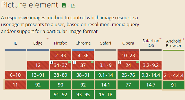
Compatibility
The <picture> element is still very good, Edge13 starts to support it, even if IE browser doesn’t support it, it just shows the <img> element at the bottom of the pocket, it won’t affect the function, so you can use it without worry.
Suitable for separate important pages
So, all things considered, the <picture> element is not really suitable for the kind of long-term iterative maintenance, mainly functional development, project complexity is relatively high projects.
It’s more suitable for scenarios like group websites and operational activities where a few pages are independent and simple.
You can optimize these pages specifically using the <picture> element, which is easy to produce results, easy to get good data, and can also reflect front-end expertise.
And these projects themselves are not complex, just a few pages, just do not need the kind of engineering, automation of things (anti-aircraft gun to hit the mosquito rather than the project is not friendly), at this time, manual processing of HTML, image resources instead of appropriate, high input-output ratio.
Reference https://www.zhangxinxu.com/wordpress/2021/07/html-picture/