In some Android devices, the safe-area-inset-top property can be recognized, but there is no height, how to solve this kind of problem?
From iPhone X, the area of bangs and the black bar at the bottom appeared, and Android systems usually imitate some designs of iPhone, and then there are more and more new models with the concept of safe-area now.
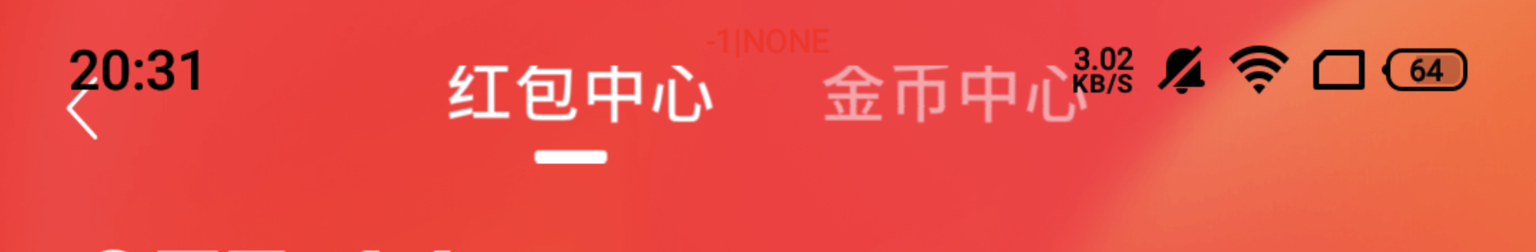
If these are not considered at all, a situation like the following may occur.
So we need to do something special for these areas.
1. Adapting secure areas in iOS
In most models, especially iOS devices, adapting secure areas is relatively simple, with 3 main steps.
1.1 Set the way the page is laid out in the visible window
The viweport-fit property has been added to make the page content completely cover the entire window.
|
|
env() can only be used if viewport-fit=cover is set.
1.2 Defining safe areas
A new feature in iOS11, a CSS function for Webkit that sets the distance of the safe area from the border, has four predefined variables.
- safe-area-inset-left: the distance of the safe area from the left border
- safe-area-inset-right: the distance of the safe area from the right border
- safe-area-inset-top: the distance of the safe area from the top boundary
- safe-area-inset-bottom: the distance of the safe area from the bottom boundary
Here we only need to focus on the safe-area-inset-bottom variable, because it corresponds to the height of the little black bar.
Note: env() does not work when viewport-fit=contain, it must be used with viewport-fit=cover. For browsers that do not support env(), the browser will ignore it.
The env() function shipped in iOS 11 with the name constant(). Beginning with Safari Technology Preview 41 and the iOS 11.2 beta, constant() has been removed and replaced with env(). You can use the CSS fallback mechanism to support both versions, if necessary, but should prefer env() going forward.
This means that the constant() used previously will not work after iOS 11.2, but we still need to do backward compatibility, like this.
Note: env() and constant() need to exist at the same time, and the order cannot be changed.
In the case of vertical screens, to limit the top bangs area, use safe-area-inset-top; to limit the bottom area, use safe-area-inset-bottom.
If you need to do calculations, you can use the calc() function.
2. Some peculiar Android phones
Many Android phones also follow the iOS standard for implementing security zones, so the above properties work fine on most Android phones.
However, during our testing, we found that there are a few peculiar phones that have the following conditions.
Looking at the style through Chrome shows that he will recognize predefined variables like safe-area-inset-top, but then resolve them to 0.
This makes it impossible to use the padding data even if we have set it. For example, we use the pocketed padding-top: 25PX style when the safe-area attribute is not supported (the upper case PX is so that it is not escaped by the plugin as vw or rem). However, in the Android devices mentioned above, the padding style will not work either.
So how to solve this problem?
3. Solution
Here we have to use js to implement it.
First we insert an invisible div into the page, set the height of the div to the height of the safe distance, then get its height by js, if the height is 0, then it is not in effect.
|
|
Then you need to execute the supportSafeArea() method additionally where the safe area property has been set.
|
|
4. Summary
Device compatibility has always been a problem we are solving on the front end, both on PC and mobile, and the diversity of browsers and the development of programming languages inevitably requires solving these problems.