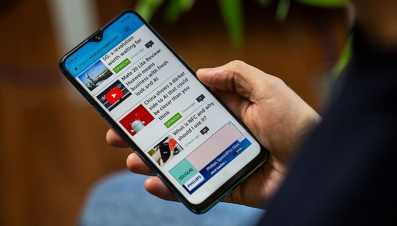
Sometimes, front-end web pages need to know whether the user is using a mobile or desktop browser.
This article, based on StackOverflow, compiles five ways for JavaScript to detect mobile browsers.

navigator.userAgent
The easiest way to do this is to analyze the browser’s user agent string, which contains device information.
JS gets this string through the navigator.userAgent property, and as long as it contains keywords like mobi, android, iphone, etc., it can be considered a mobile device.
The advantage of this method is that it is easy and convenient, but the disadvantage is that it is unreliable, as the user can modify this string to make the mobile browser masquerade as a desktop browser.
Chromium-based browsers also have a navigator.userAgentData property that does something similar. The difference is that it parses the user agent string into an object with a mobile property that returns a boolean value indicating whether the user is using a mobile device or not.
Translated with www.DeepL.com/Translator (free version)
|
|
Note that Apple’s Safari and Firefox browsers do not support this property, see the Caniuse website for details.
In addition, there is a deprecated navigator.platformproperty, which is supported by all browsers, so it can be used as well. It returns a string indicating the user’s operating system.
window.screen,window.innerWidth
Another way to tell if it is a phone is by the screen width.
The window.screen object returns information about the screen of the user’s device, and the width property of this object is the width of the screen (in pixels).
In the above example, if the screen width window.screen.width is less than 500 pixels, it is considered a cell phone.
The disadvantage of this method is that if the phone is used in landscape, it will not be recognized.
The other property window.innerWidth returns the width of the visible part of the web page inside the browser window, which is more suitable for specifying the style of the web page at different widths.
window.orientation
The third method is to detect the screen orientation, the mobile screen can change the orientation at any time (horizontal or vertical), the desktop device can not do so.
The window.orientation property is used to get the current orientation of the screen, only mobile devices have this property, desktop devices will return undefined.
Note that the iPhone’s Safari browser does not support this property.
touch event
The fourth way is that the DOM element of the mobile browser can specify a listener function for the touch event via the ontouchstart attribute. Desktop devices do not have this property.
window.matchMedia()
The last method is to combine CSS to determine this.
CSS specifies responsive styles for web pages through media queries. If a media query statement for a cell phone is in effect, it is assumed that the current device is a mobile device.
The window.matchMedia() method takes a CSS media query statement as an argument and determines if the statement is valid.
|
|
In the above example, the parameter to window.matchMedia() is a CSS query statement indicating that it will only work on devices with a screen width of up to 700 pixels. It returns an object whose matches property is a boolean value. If it is true, it means that the query is valid and the current device is a cell phone.
In addition to judging by screen width, you can also judge by the precision of the pointer.
|
|
In the above example, the CSS statement pointer:coarse indicates that the current device’s pointer is imprecise. Since the phone does not support mouse, only touch, this condition is met.
Some devices support multiple pointers, such as both mouse and touch. pointer:coarse is only used to determine the primary pointer, in addition there is an any-pointer command to determine all pointers.
|
|
In the above example, any-pointer:coarse means that all pointers, as long as one of them is inexact, will match the query condition.
Toolkit
In addition to these methods above, you can also use a toolkit written by others. Here we recommend react-device-detect, which supports multiple granularity of device detection.