Whether it is an instance component or an HTML component, passing parameters is inevitable.
In the case of the Web Components component, for example, if we want to pass width and height, we can use custom width or height properties, e.g., passing parameters is inevitable for both example components and HTML components.
In the case of a Web Components component, for example, to pass width and height, we can use custom width or height properties, e.g.
|
|
But sometimes the parameter we need to pass is a piece of HTML content, so how do we pass this HTML into the component?
In this case, we need to use the slot element <slot>.
Only useful in Shadow
The <slot> element can only be used in the Shadow DOM to have a slot effect; otherwise, it can be treated as a normal HTML element.
For example, this HTML code directly under the <body> element is not valid, i.e. the image element cannot replace the content of the “placeholder element”.
The <slot> element is designed for Web Components component development, so to speak.
Basic usage diagram
Here’s a simple example to show you how the <slot> element works.
As shown in the alert popup box component, the structure of the popup box is fixed, and what changes is the content of the alert, which can then be passed in as a parameter.
Let’s define a popup box component named ‘zxx-alert’, and for the sake of simplicity, we’ll put the component style and HTML structure in the <template> element, as follows.
|
|
In this case, there is the slot element, whose HTML code is shown below.
|
|
indicates that this part is externally replaceable by other HTML in the custom element.
Of course, for this to take effect, it needs to be converted to a Shadow DOM element and be part of the custom component, and the relevant implementation code is shown below.
In this case, just set the content of the corresponding matching slot within the <zxx-alert> element (by matching the slot attribute with the name value of the <slot> element), and this part will appear as an alert message, e.g.
At this point, there is an effect similar to the following figure.
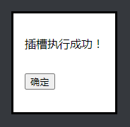
The DOM content is now used as a parameter in the alert box, so you can see how flexible it is to use the <slot> element for dynamic content rendering.
Slot matching rules
In a nutshell.
The <slot> slot element will be matched if the value of its name attribute matches the value of the slot attribute of any HTML element.
The details are as follows.
The name value is unique
<slot> supports the name attribute, which can be seen as an identifier and needs to be unique, since multiple identical names will match at most one slot element. For example.
The following name="alert" slot element would not be replaced by HTML, as shown in the following image (the following line of text).

The slot attribute value may not be unique
The value of the slot attribute may not be unique, for example, the following HTML code looks like this.
You will see two successful execution messages, as shown below (screenshot from Firefox browser).

One component can have multiple slots
Multiple slots can be used for the same component, e.g. to reserve the position of a button.
At this point, you can see that not only the content of the prompt has been inserted, but the cancel button has also been inserted into the pop-up box, as shown in the following screenshot.

Must be a child element of the component
The element used to match must also be written in the custom element component and exist as a child element, e.g. the following paired element is outside the custom element and has no slot effect.
and the following, where the matching element is not a child element but a child of a child element, are also not displayed as valid slots.
The effect is as follows, and you can see that there is no cancel button.

Even if <div> element has display:contents set, it is not valid.
Events in the slot element
Take the example of the cancel button in the popup box, what if we add an event to the slot of the cancel button?
This is the case, although visually, the matching element replaces the slot element, in fact, the position of the two does not change and the HTML structure is as follows.
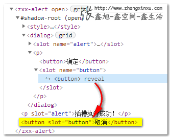
Therefore, to close the popup box by clicking the cancel button in the popup box, you only need to write events on the original <slot> element or the matching <button> element, and the DOM hierarchy is still handled according to the original DOM relationship.
For example, both of the following can close the popup box.
Or handle it when defining the Web component (displaying only the key code).
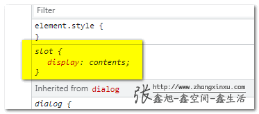
Special display values
As far as I know, the <slot> element is the only element whose display defaults to contents (feel free to correct me if I’m wrong).
What is display:contents?
display:contents does what its name implies; only the content box, and all the rest of the boxes, are eliminated, which produces the following phenomena.
-
All layouts require the box model to be used, so the
display:contentselement has no layout effect; for example, the<item>element below is nested by<div>but is still a flex child, because this nested<div>does not participate in the layout.The rendering is as follows.
-
width-height backgrounds, etc., act on non-content boxes, so the
display:contentselement cannot set the size and cannot set the background color. -
The
display:contentselement can only set CSS related to the text content, such as color color, font-size font size, etc.
In a nutshell, display:contents means “take up space and not do anything”, so if you don’t have much idea what this CSS declaration does, just think of the <slot> element.
Not the focus of this article, so I won’t go further.
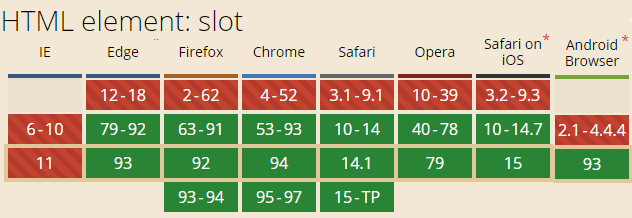
The <slot> element compatibility is consistent with the Web Component Development V2 specification and is supported by modern browsers.