Matplotlib Beginner Tutorial
MATLAB
MATLAB is a combination of the words Matrix & Laboratory, meaning matrix factory (matrix laboratory). It is a high-tech computing environment mainly for scientific computing, visualization and interactive programming released by Mathworks, Inc.
It integrates many powerful functions such as numerical analysis, matrix calculation, scientific data visualization, and modeling and simulation of nonlinear dynamic systems in an easy-to-use Windows environment, providing a comprehensive solution for scientific research, engineering design, and many scientific fields where effective numerical calculations must be performed, and largely free from the editing mode of traditional non-interactive programming languages (such as C, Fortran), representing the advanced level of today’s international scientific computing software.
Matplotlib
Matplotlib, the most widely used data visualization library in Python, was first developed by John Hunter in 2002 with the aim of building a Matlab-style interface to plotting functions. It takes advantage of Python’s numeric and Numarray modules, and clones many of Matlab’s functions to help users easily obtain high-quality 2D graphics.

Matplotlib can draw many kinds of graphs including ordinary line graphs, histograms, pie charts, scatter plots, and error line graphs, etc. It is easy to customize various properties of graphs such as the type of lines, color, thickness, font size, etc. It supports some of the TeX layout commands and can display mathematical formulas in graphs in a beautiful way.
Matplotlib is also very easy to master, because most of the functions used in Matplotlib have the same name as the corresponding functions in Matlab, and the meanings of various parameters and usage methods are the same, which makes users familiar with Matlab feel comfortable to use. For those who are not familiar with Matlab, the meaning of these functions is often clear at a glance, so it takes very little time to master them.
I have used MATLAB a lot over the years for data analysis and visualization. MATLAB is good at drawing nice graphs. When I started working with EEG data, I found that I needed to write applications to interact with my data, and developed an EEG analysis application in MATLAB. As the application became more complex, needing to interact with databases, http servers, and manipulate complex data structures, I began to struggle with the limitations of MATLAB as a programming language and decided to migrate to Python. Python as a programming language made up for all of MATLAB’s shortcomings, but I had a hard time finding a 2D drawing package (3D VTK, on the other hand, exceeded all my needs).
When I went looking for a Python drawing package, I had a few requirements.
- The drawing should look good - release quality. An important requirement for me is that the text looks good (anti-aliased, etc.)
- Postscript output for containing TeX documents
- embeddable GUI for application development
- The code should be easy enough that I can understand it and extend it
- Drawing should be easy
Not finding a package that fit my needs, I did what any self-proclaimed Python programmer would do: rolled up my sleeves and started building my own. I didn’t have any real experience with computer graphics and decided to emulate MATLAB’s plotting capabilities because MATLAB does it so well. This had the added advantage that many people had a lot of experience with MATLAB, so they could quickly start plotting in python. From a developer’s point of view, having a fixed user interface (the pylab interface) is very useful because the contents of the code base can be redesigned without affecting the user code.
Matplotlib architecture
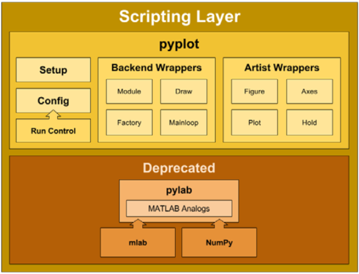
The Matplotlib architecture is logically divided into three layers, located on three different levels. The upper level content can communicate with the lower level content, but the lower level content cannot communicate with the upper level content. The three layers, in order from top to bottom, are
- Scripting (scripting layer)
- Artist (presentation layer)
- Backend (backend layer)
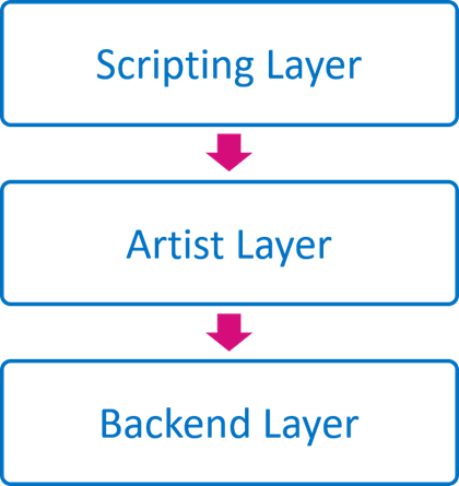
The access relationship between them is: Scripting accesses Artist, Artist accesses Backend
Backend
Backend is the bottom layer, that is, the matplotlib API layer. backend in the mpl.backend_bases class, which contains a variety of keyboard, mouse Event class, used to draw lines, graphics RenderBase class, responsible for the Figure object and its output is separated from the FigureCanvasBase class and so on (just an interface, specific different outputs, such as PDF, PNG definition in the backends class). That is, all derived / output methods are placed under mpl.backends, such as Qt5 backend for mpl.backends.qt5agg. output PDF backend for mpl.backend_pdf, where the class is responsible for interacting with different backends / platforms. This design ensures the decoupling of the code and the unity of design.
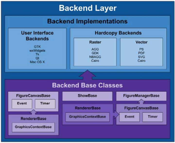
Different backends provide different APIs, which are defined in the backends class. This layer contains the matplotlib API, which is a collection of several classes that are used to implement various graphical elements in the underlying layer. The main ones include.
- FigureCanves: used to represent the drawing area of the graph
- Renderer: the object used to draw the content on the FigureCanves.
- Event: object used to handle user input (keyboard, mouse input)
Artist
If what the Backend layer does is establish an architecture of Canvas, Renderer, Event, then what the Artist layer does is tell the program what to draw on the Renderer to the Canvas. This layer doesn’t have to touch the backend, doesn’t have to relate to the differences between different implementations, and just tells the Backend layer what it needs to DRAW.
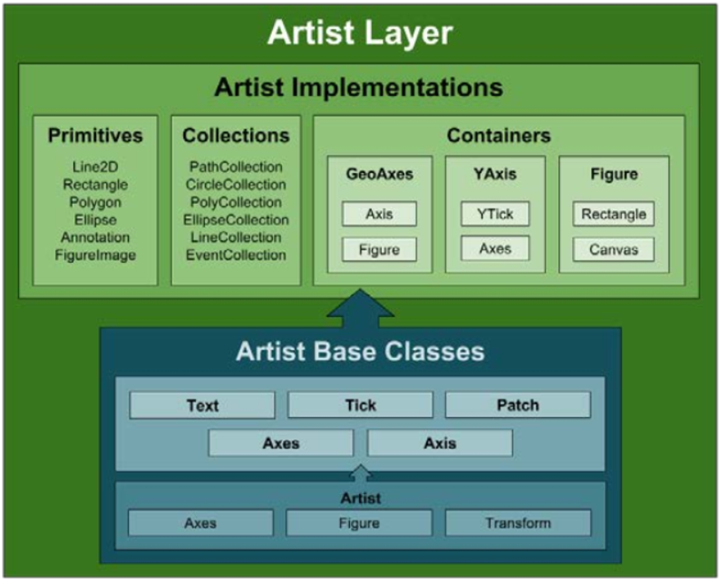
All elements are instances/subclasses of the mpl.artist.Artist class. artist Module contains a large number of already defined elements, including Tick scales, Text text, Patch composite graphics (axes, shadows, circles, arrows, Rectangle, etc.), Figure graphics, Legend labels, Line2D The elements in the artist Module interact and pass information through the draw method and the backend Module, which is unidirectional.
The middle layer of the entire architecture, where all the various elements used to compose an image are located, such as titles, axes, axis labels, markers, and other content are instances of Artist. And these elements form a hierarchical structure.
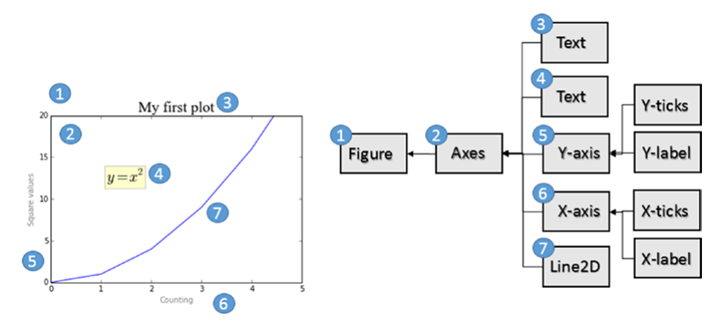
Artist layer has many visual elements, i.e. title, axis labels, scale, etc. Artist is divided into two categories, Primitive Artist and Composite Artist.
- Primitive Artist is a standalone element containing basic shapes, such as a rectangle, a circle or a text label
- Composite Artist is a combination of these simple elements, such as horizontal coordinates, vertical coordinates, graphs, etc.
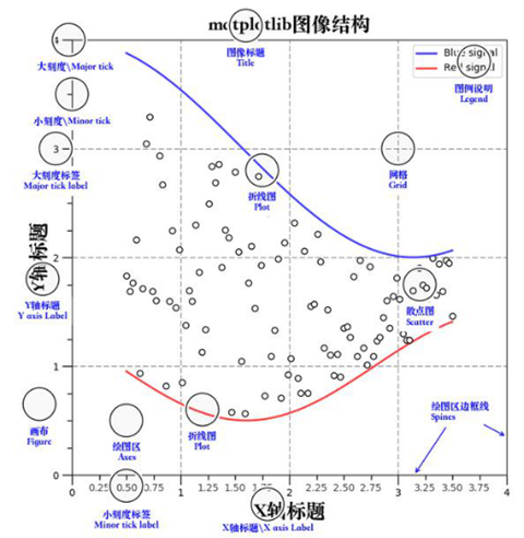
When dealing with this layer, it is mainly the upper layer of the graphical structure that you deal with, and you need to understand what each of these objects represents in the graph. The following figure shows the structure of an Artist object.
The top layer of Artist is the Figure layer, representing the graphical concept; Axes is on top of Figure, representing what the axes draw (i.e. axis objects), and there will be one Axes object for each dimension; Axis is used to display the values on the axes (i.e. scales and scale values), the position of the scales is managed by Locator object, and the label format of the scales is adjusted by Formatter object.
Scripting
If the previous layer represents HTML, then this layer represents JavaScript, and you can think of this layer as an interactive interface with state persistence. Like Python’s interactive interpreter. mpl.pyplot is the entire entry point for this layer.
This layer contains a pyplot interface. This package provides the classic Python interface to manipulate matplotlib programmatically based, it has its own namespace, and requires importing the NumPy package.
Graphing with Matplotlib Layers
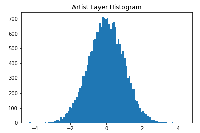
Drawing with Artist Layer
|
|
- ax = fig.add_subplot(111): follows the MATLAB convention. Creates a grid containing one row and one column and uses the first cell in the grid as the location of the execution object.
- ax.hist(x,100): Creates a rectangular sequence of original Artistlayer objects for each bar and adds them to the ExesContainer. 100 means 100 bar bars are generated.
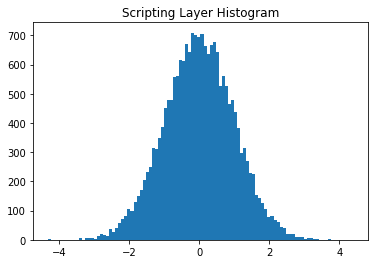
Drawing with Scripting Layer
Artist or Scripting Layer?
Obviously, using the Scripting layer (matplotlib.pyplot) is relatively easier to use, lighter, and has a simpler syntax. Although the Artist layer is preferred by professional developers. But it is better to master both.
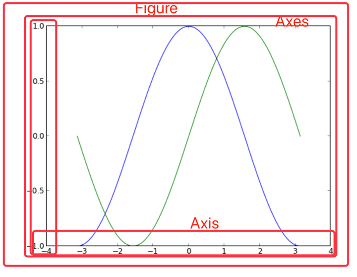
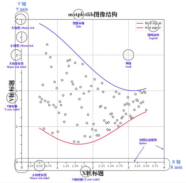
Matplotlib image structure
- anvas (drawing board) is located at the bottom, generally not accessible to users
- Figure (canvas) is built on top of Canvas
- Axes are built on top of Figure
- Auxiliary display layers such as axis, legend, and image layers are built on top of Axes
Container layer
The container layer mainly consists of Canvas (canvas), Figure (graphics, drawing area), Axes (axis)
- Canvas is the system layer at the bottom of Canvas, which acts as a drawing board in the process of drawing, i.e., the tool that places the Figure (drawing area)
- Figure is the first layer above the Canvas and the first layer of the application layer that needs to be manipulated by the user, acting as the canvas in the drawing process.
- Axes is the second layer of the application layer, which acts as the drawing area on the canvas during the drawing process.
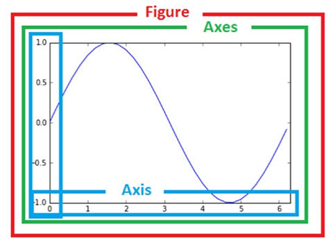
- Figure: means the whole figure (you can set the size and resolution of the canvas by figure(), etc.)
- Axes(coordinate system):the drawing area of the data
- Axis: an axis in the coordinate system, containing size limits, scales and scale labels
Features.
- A figure(canvas) can contain multiple axes(coordinate system/plotting area), but an axes can belong to only one figure.
- An axes (coordinate system/drawing area) can contain multiple axes (axes), including two for 2d coordinate system and three for 3d coordinate system
The auxiliary display layer is the content of Axes (drawing area) other than the image drawn from the data, mainly including
- Axes appearance (facecolor)
- Border lines (spines)
- Axes (axis)
- Axes name (axis label)
- Axes scale (tick)
- axis label * tick label
- grid
- legend
- title
- …
This layer can be set to make the image display more intuitive and easier to understand by the user, but does not have a substantial impact on the image.
Auxiliary display layer
The auxiliary display layer is the content of Axes (drawing area) other than the image drawn from the data, mainly including
- Axes appearance (facecolor)
- Border lines (spines)
- Axes (axis)
- Axes name (axis label)
- Axes scale (tick)
- axis label * tick label
- grid
- legend
- title
- …
This layer can be set to make the image display more intuitive and easier to understand by the user, but does not have a substantial impact on the image.

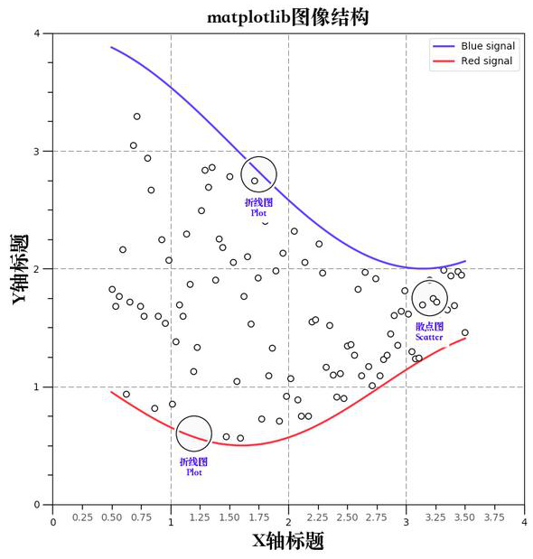
Image layer
The image layer refers to the image layer within Axes via
- plot (line graph)
- scatter (scatter plot)
- bar (bar chart)
- histogram
- pie
- …
Drawing with PYPLOT
plt.plot() plots
Quickly get started with plot() plotting
This method of plotting graphs is done entirely through the pyplot interpretation layer. When the plt.plot() method is called, if the system does not detect the existence of a Figure object and an Axes object, one is created, and if detected, it is used directly. The backend selected after creation is the default backend, and the canvas is generally of class mpl.backends.backends_xxagg.
|
|
pyplot.plot can accept drawing objects and some command-line like parameters, with a choice of colors, dotted line states (horizontal lines, vertical lines, stars), and various other shapes. plot’s parameters, see Line 2D, can be specified as follows.
|
|
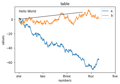
pyplot can be handled directly in a process-oriented manner, and calling plt.axis will set the axis property in the current Axes.
|
|
subgraphics, labels, scales, text
A process-oriented approach allows us to do image plotting quickly, with some of the more important methods, such as
- subplot(m,n,a) Plot multiple graphs on a single Figure and Axes, and you can return to this subplot for modification at any time.
- subplots_adjust() Quickly adjusts the graph spacing
- title() Set the title
- grid() sets the grid
- xlabel() sets the x-axis label
- xticks() sets the x-axis scale
- legend() controls the legend display
- text() places text at the specified location
|
|
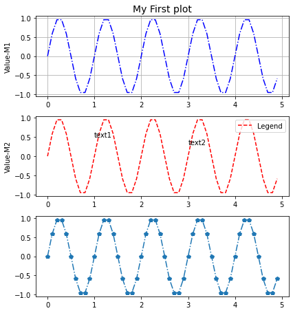
Figure and Axes: graphs, subgraphs and their axes
Figure and Axes objects
Figure has many more methods, the frequent ones are
- add_axes(rect) Add sub axes
- add_subplot(mna) Add a subplot
- clear() Clears the image
- draw(renderer) The underlying interface
- gca() Current Axes
- get_children() Get child elements
- hold() Ugly MATLAB compatibility
- savefig() Save the image
- set_canvas() underlying interface
- show() Show the image
- subplots_adjust() subplots fine-tuning
- text() Place text
Axes has many methods, there are about 100 individual methods, so no examples will be given here, consult the manual.
Calling and creating Figure and Axes objects
Plotting with plt is certainly convenient, but sometimes we need to fine tune and generally need to use.
- gca() returns the Axes object in the current state, the Alias of Fig. gca()
- gca().get_children() Convenient to see the elements under the current Axes
- gcf() returns the Figure object in its current state, which is generally used to iterate through the Axes of multiple figures (plt.gcf().get_axes()). Another way is to use the index of the Axes matrix to extract the Axes of a subplot.
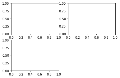
For those who want to redraw a graph instead of drawing it in a Figure and distinguishing it into several subplots, create a new Figure object directly using plt.figure(), which can also be captured using plt.gcf(). Each figure can be composed of many subplots, each of which has only one Axes, and they can share axes. Each subplot has its own AxesSubplot subaxis, contained in the total Axes.
Just as the interaction between the Figure object and the Canvas object is performed with canvas = FigureCanvasBase(fig), the association between the Figure object and the Axes object can be performed using the following methods.
- axes = plt.subplot(mna) # MATLAB way, generally used only for interaction, not capture the output
- Axes = mpl.axes.Axes(fig,*kwargs # OOP approach, less commonly used
- fig, axes_martix = plt.subplots(nc,nr) # Fast way, suitable for fast creation of Figure objects and Axes objects, generally used to create plots with a specified number of subplots.
- axes = fig.add_subplot(mna) # Suitable for creating a single subplot when Figure objects are available, similar to subplot(). The advantage over subplots is that you can use gridspec to draw plots with X-Y axis dependent graphs.
- axes = fig.add_axes([rect]) # Suitable for adding a small subplot and its Axes at a specified location of a graph. generally used as a drawing of subsidiary graphs.
An example: the OOP approach
|
|
An example: plt.subplots method
|
|
Common methods of drawing
Firure common methods
- subplots_adjust is equivalent to calling subplots_adjust(left=None, bottom=None, right=None, top=None,wspace=None, hspace=None) top function for adjusting the presentation of width, height, etc. around the subplot.
- savefig(fname,dpi,bbox_inches,format) to save the image
Axes common methods
- hist bar/pie pie/box box etc.
- plot If you don’t specify the type of plot, such as pie or bar, just pass in plot and fill in the parameter as data.
- add_patch Add a graph
- annotate Add arrows
- text Add a text description
- get(set)_x(y)lim Get/set the range of different axes
- g/s_(x/y)ticks Set the scale position #plt.xticks((0,1,2),(“a”, “b”, “c”)) can Quickly specify the position and label value.
- g/s_(x/y)ticklabels Set tick labels
- g/s_(x/y)label sets the axis name
- title Header settings
- legend setting
For Axes call get/set and many other methods, in fact, you can also directly call plt global objects, but call axes individual elements can get more fine-grained control, and more object-oriented some.
|
|
|
|
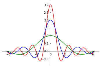
SPINES coordinate system plotting
|
|
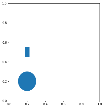
PATCH graph drawing
Graph drawing requires calling the axes.add_patch() method, passing in parameters for the graph, i.e. the line/path/patches object. Very similar to Qt graph drawing, the underlying API.
|
|
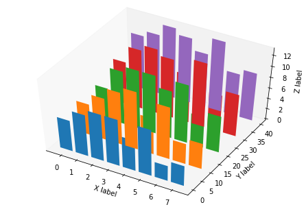
AXES3D charting
|
|
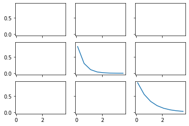
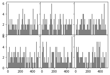
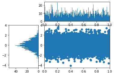
Subplot grid and multi-panel plotting
The difference with fig.add_subplot(), use fig.add_axes() method to manually create a new Axes, but does not formulate the location of this Axes, you need to manually specify, generally used as a subsidiary graphics drawing, after calling this subaxes, you can draw on the subsidiary graphics.
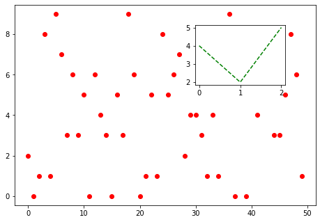
In the introduction of add_subplot(), you can define “12X” here to mean 1 horizontal and 2 vertical subplots, and select the Xth one. However, for precise position control, you can use the GridSpec object, pass in a square size, and then make a slice call to add_subplot() as an argument, so that you can do fine subplot control.
|
|
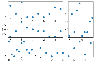
The following is an example of an application of Gridspec.
|
|
GCA advanced usage
The plotting can be finely controlled using plt.gca(), e.g.
|
|
It is possible to draw a filled graph consisting of two curves, which is useful when representing areas, such as integral areas. In addition, it can be used in this way.
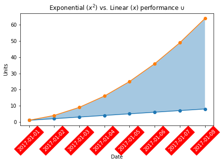
gca() is essentially an Axes object, and a review of the documentation shows that this object has many available methods, such as in this case taking out the x sub-axis and traversing the scale labels of this axis (Text object), setting the rotation, transparency and color, background, for longer time dates, so that the axis text is not crowded together.
Matplotlib style
The generated graphs can be easily embellished using several embellishment styles that come with matplotlib. You can use matplotlib.pyplot.style.available to get all the beautification styles:
Check the specific official website see the style reference sheet.
Beautify using the self-contained style of.