With around 100 million new tablet devices activated in the last 12 months and Chrome OS activations up by 92%, it is the fastest growing desktop platform. This means that with more than 250 million large screen devices running Android on tablets, foldable devices and Chrome OS devices, and the number of foldable devices in use growing by more than 250% year-on-year, the ‘big screen’ is becoming an important and fastest growing segment of Android devices. This has led device manufacturers to realise that optimising for larger screens is an opportunity to differentiate their devices in the premium phone segment.
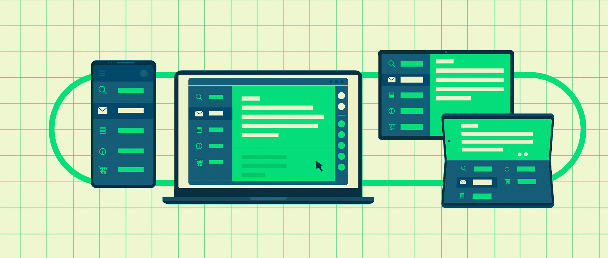
With the rapid development of tablets and foldable devices, it’s time to stop thinking about phones and tablets separately and instead offer apps for an entire ecosystem to increase their impact in the market. In this article we’ll look at how developers can quickly embrace and enter this market segment with the new APIs and tools we offer.
User engagement
In the months following the Android Developer Summit, the Play Store has introduced new incentives, including the ability to rate apps by device type, to encourage developers to look more towards the big screen. So now is the perfect time to embrace these changes, not only to cater for the market changes that will follow, but also to address the lack of user experience caused by the lack of large screen adaptations.
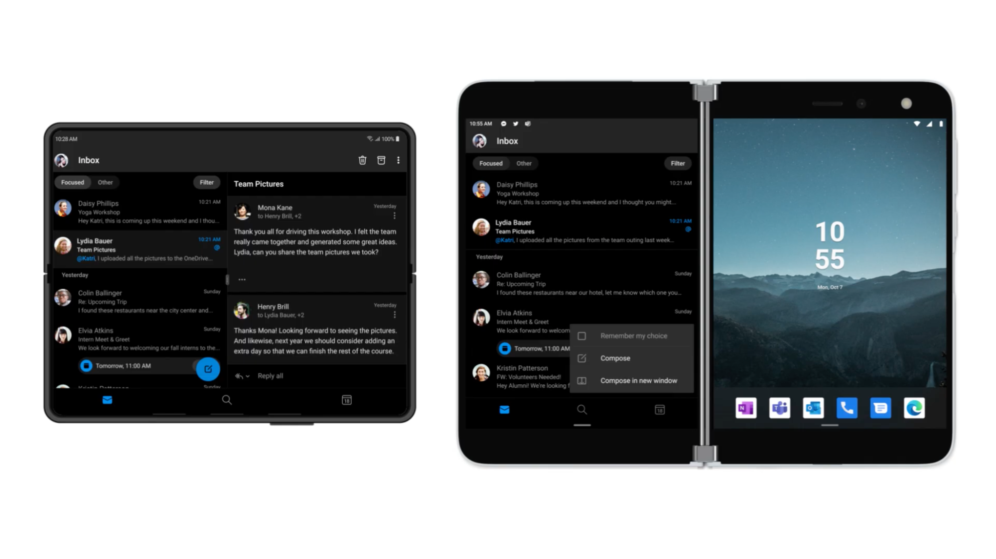
△ Microsoft Outlook app interface optimised for large screens
We also observed that apps that were optimised for all screen sizes achieved good results in terms of metrics around user interaction, retention and more. One success story, Candy Camera, for example, is that by optimising the layout of foldable devices and large screens, users on these devices have spent 10% more time in the app and have seen a 14% increase in 7-day user retention, and this is not an isolated case. Another case in point is Microsoft Outlook, whose recent update takes full advantage of the large screen by using a dual-window layout to view both inbox and email content, and the ability to compose emails independently in a single window with multiple displays. These examples are a good indication that it’s time to start designing and developing freely, free from the constraints of a single interface on a mobile phone.
But don’t worry too much, we’ve done a lot of work to make the whole development cycle as easy as possible, so take a look at the tools we’ve provided to help you get better at adapting to larger screens.
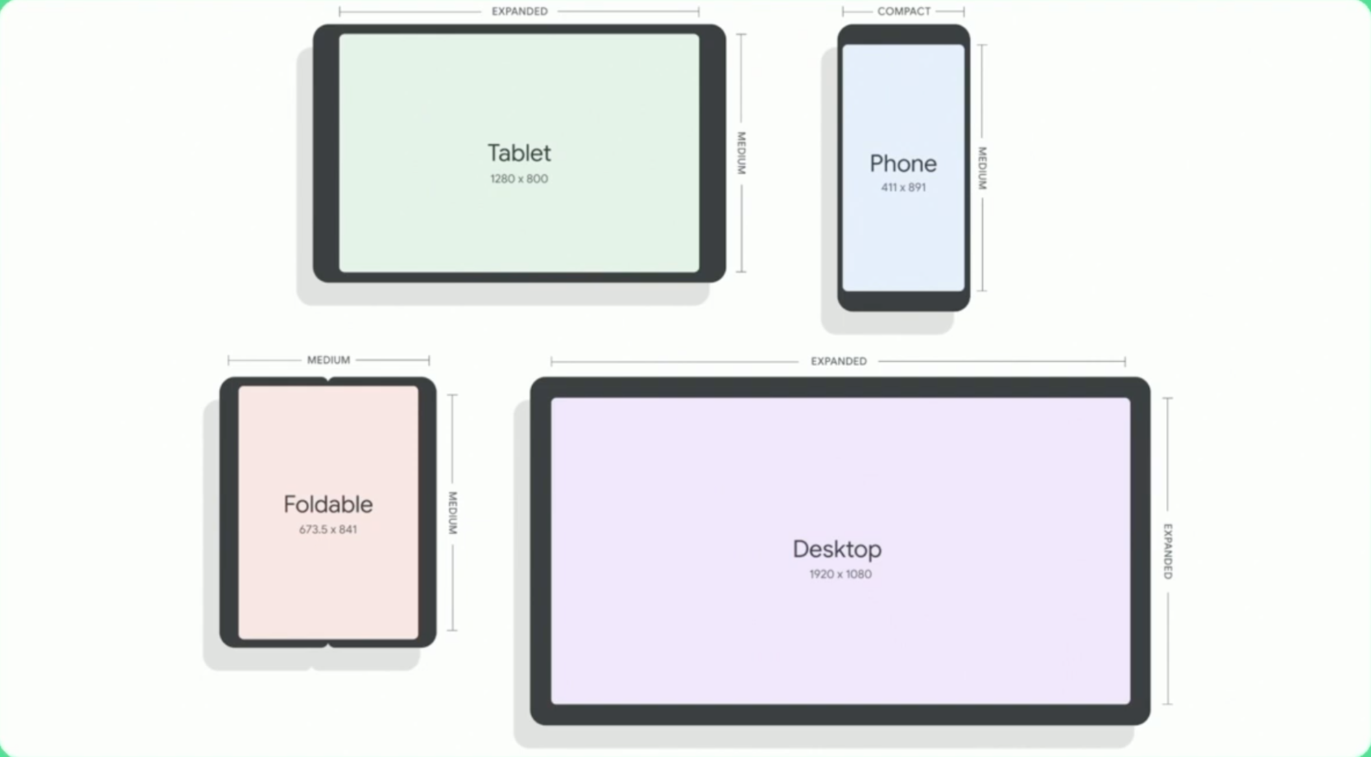
Window Size Classes and Reference Devices
In a diverse device ecosystem, the different shapes and sizes of Android devices make the layout of apps very flexible. Running the same app on different devices should be flexible enough to fit the screen size of the different devices. To this end, we have delved into the Android device market and taken some inspiration from best practices in adaptive and responsive development for the web to build the basis of a new dynamically resizable Android interface, which we call the window size class.
A window size class is a subjective set of viewport breakpoints against which you can design, develop and test resizable app layouts. These breakpoints will help you understand the key sizes to optimise in order to adapt your application to the entire ecosystem. There are three window size categories, Smaller, Medium and Expanded, which are designed to balance simplicity and flexibility of layout to optimise your application for specific situations. We recommend that you use the window size breakpoints to make advanced application layout decisions, and for changes to the layout grid columns they can also be mapped to Material Design layout breakpoints.
The new WindowSizeClass API, available in Jetpack WindowManager 1.1, will allow you to get rid of the error-prone isTable logic. These new APIs will also eliminate the need for custom logic when switching devices between landscape and portrait, in most cases simply designing for different window size class breakpoints and the app will adapt to the correct layout and various application states.
|
|
One important point is that from Android 12 onwards, apps will be allowed to be resized at will and all apps will be allowed to run in multi-window mode. In the case of the Samsung Galaxy Fold series, the split-screen mode available makes for seven times better screen utilisation, and the fact that split-screen allows users to resize according to their preferences further highlights the importance of building dynamically resizable interfaces.
Considering the layout from a device and configuration perspective, we have made each window size category representative of a number of typical device configurations (shown below), which will be a useful reference when you are considering designing layouts based on breakpoints. Where smaller represents the typical pattern of a phone in portrait mode, medium represents the size of most tablets and larger foldable devices, and expanded represents the display of a tablet or larger foldable device, or a desktop device in landscape mode.
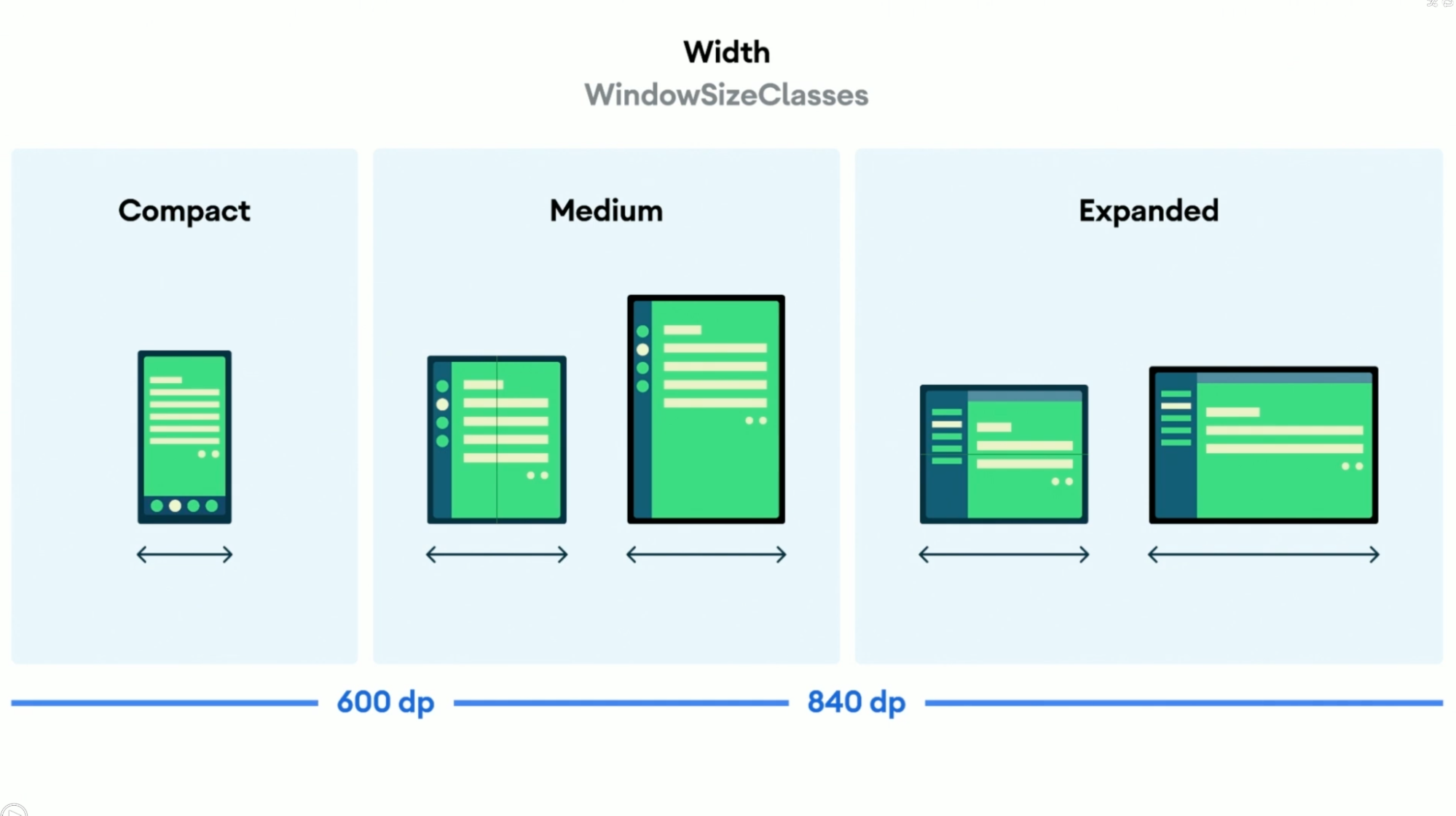
△ Representation of width-based window size classes
In addition to the three width-based breakpoints above, we have also introduced height-based breakpoints with the same class name to allow for more advanced layout scenarios and to give more flexibility. Suppose we need to use smaller height breakpoints to optimise the layout of a landscape mobile interface, although this may sound complicated, don’t worry, according to many Android developers we have spoken to, in most cases it is only necessary to adapt the layout based on width.
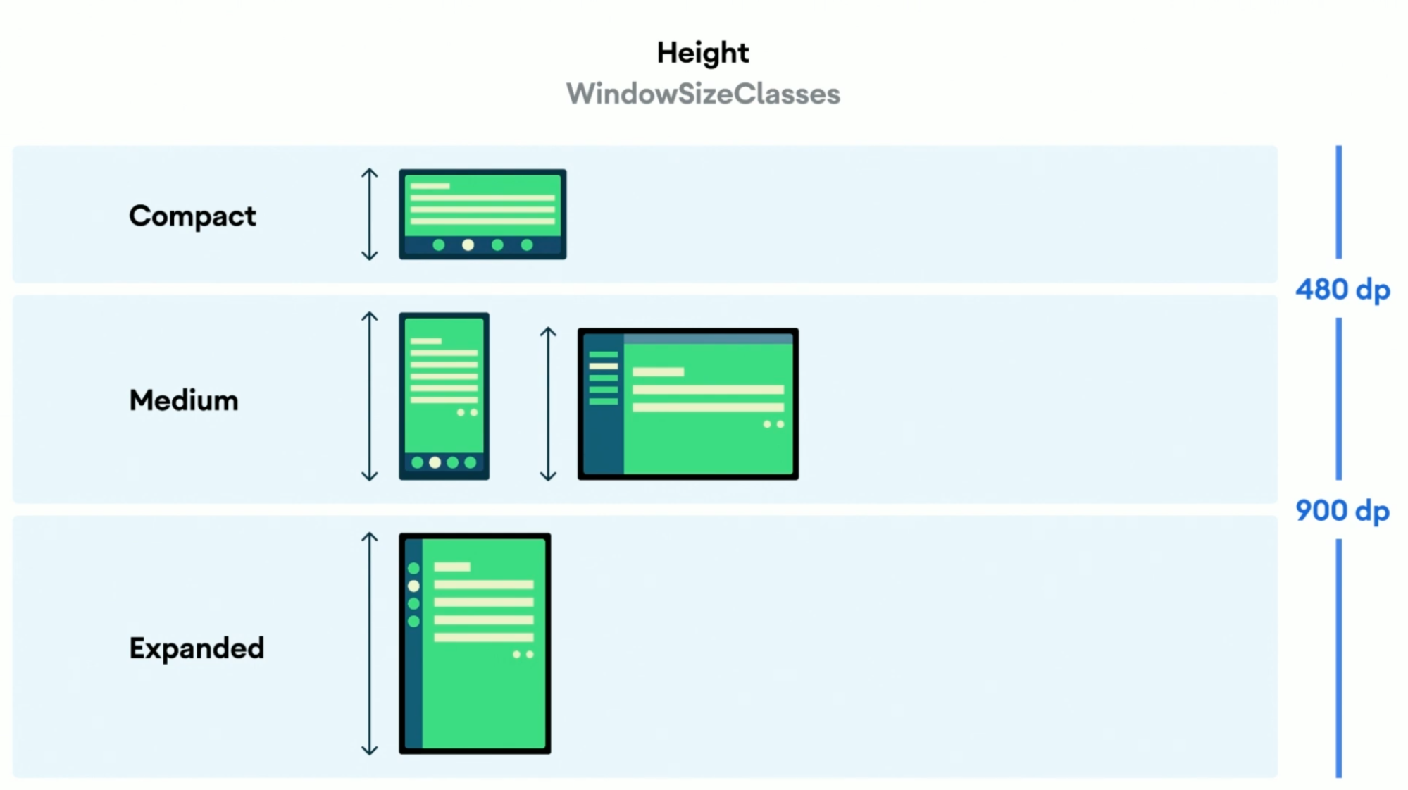
△ Representation of height-based window size classes
All in all, the advent of the window size class represents a major advancement in adaptive and responsive layout development for Android, including updated and optimised guidelines, a new API in Jetpack WindowManager and new tools in Android Studio.
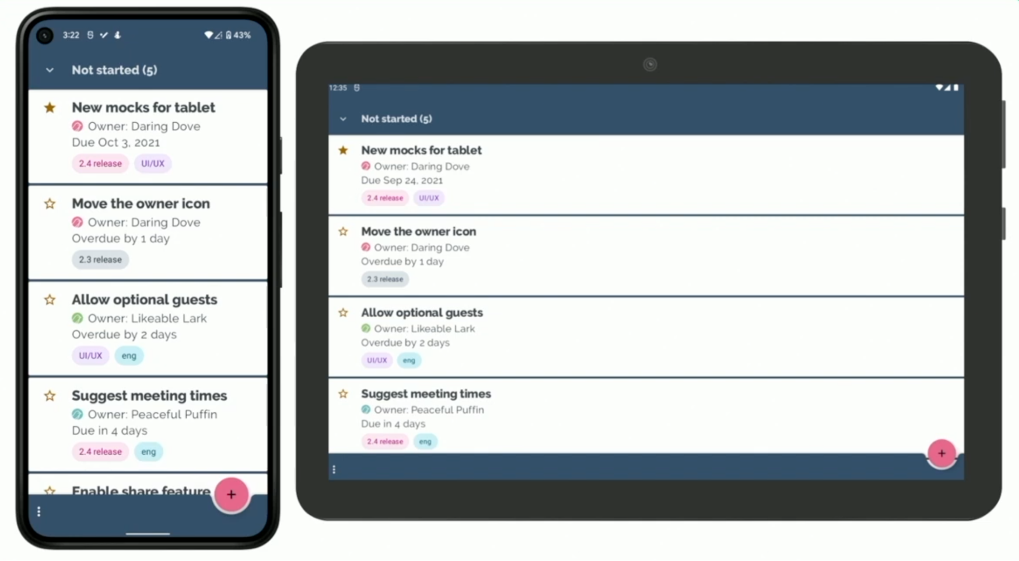
Speaking of Android Studio, we’re introducing a new category of tools in Android Studio Bumblebee, which we’re calling Reference Devices, and it’s been introduced to allow Android apps to be built to be responsive and adaptable to all device classes. After thorough research of market data, we have provided four Reference Devices, representing phones, foldable devices, tablets and desktop devices. They cover both the mainstream devices currently on the market and the fast-growing segments, as well as ensuring that the app will work in most window size categories.
△ Four types of Reference Devices
If you just want a quick overview of what to look for in this article on adapting to large screens, please keep the following points in mind:
- to ensure that your app is displayed correctly on different device sizes, give priority to optimising the layout for the smaller and expanded width size categories.
- test your application on all Reference Devices, prioritising the best layout in the medium category.
- to provide a better user experience, add features that make sense for the application, such as support for the collapsed state of foldable devices or optimisation for keyboard, mouse and stylus input support.
For more detailed information on window sizing classes, please refer to window sizing classes.
For an example of a practical application of the Window Size class, see JetNews Compose example.
Adapting to large screens
Designing a beautiful and responsive interface is the first step in developing an app, but implementing and maintaining that design can be a challenge, and we’re committed to providing efficient tools to simplify your work. We’ll now look at how to update existing apps with the new Jetpack API and Android Studio features to optimise for all screen sizes.
We’ll use as an example Trackr, an open source task management app that we’ve recently updated to better support larger screen devices, which was developed to demonstrate best practices for supporting an accessible feature experience in Android, and with the recent updates for larger screens, it’s certainly a good example.
△ The Trackr look before the change
The image above shows Trackr before we made the changes, you will see a single window task list and a bottom application bar to navigate to the archive or settings page, regardless of device or screen. Next, let’s optimise Trackr for larger screens.
NavigationRailView
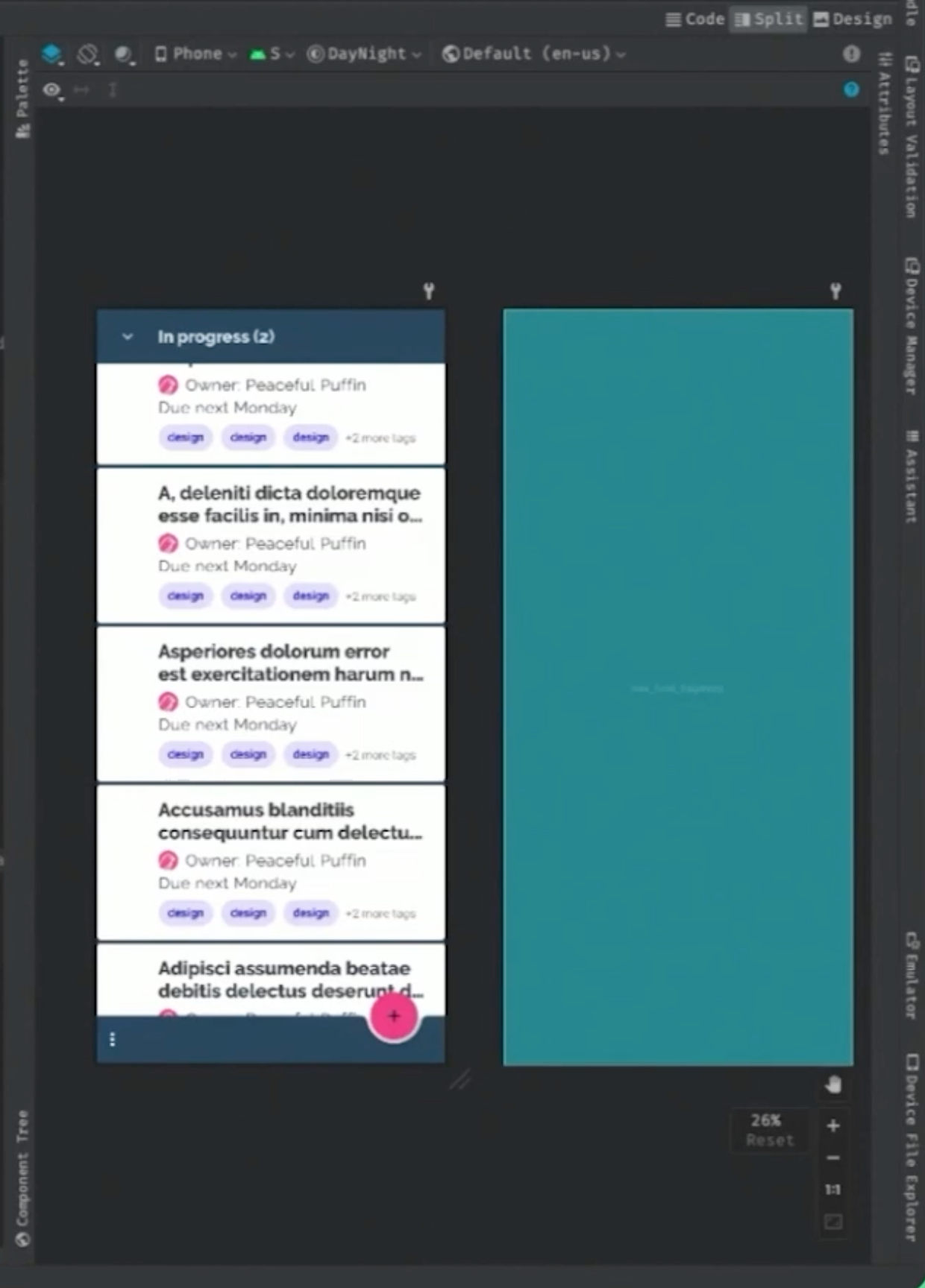
We are working on a new tool in Android Studio Chipmunk, Visual Linting, which allows us to check the interface in Layout Validation and display some warnings and relevant suggestions. We are using Visual Linting to check the layout of Trackr to identify potential problems with the large screen display through the tool. We can do this by opening the main_activity layout and then opening the Layout Validation tool (which can also be found via the View - Tools Window path).
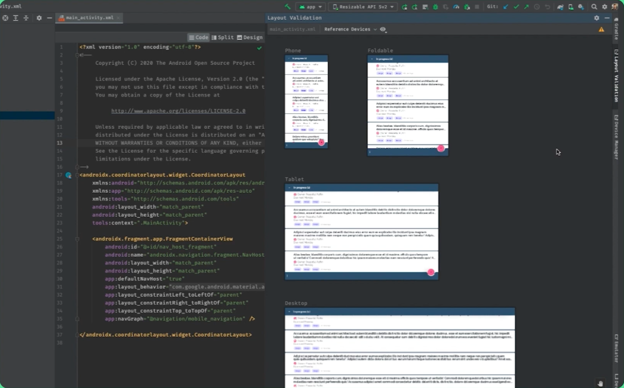
△ Checking the interface in Layout Validation
In the Layout Validation interface, you will find a new category for Reference Devices, which allows you to use the new Reference Devices feature in Android Studio. In the top right corner of Layout Validation you will find a warning icon, click on this icon to open the warning window and click on each warning to show which devices are affected. As you can see above, we will find two warnings related to large displays: the bottom application bar is only recommended for smaller screens and some rows of the MaterialTextView contain more than 120 characters.
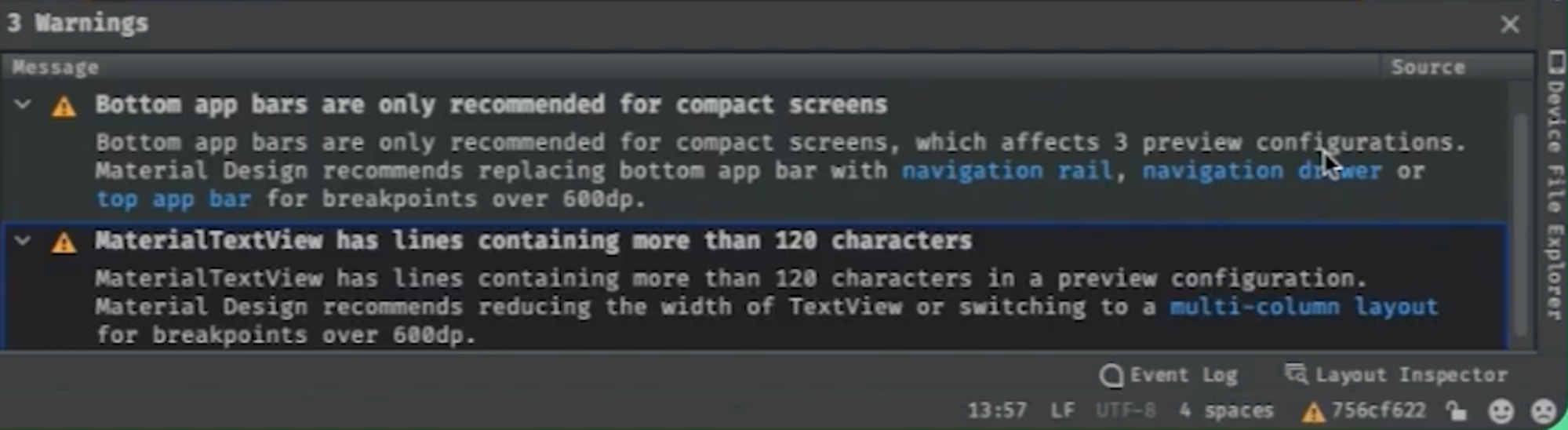
△ Warning window
Expand Warnings to see if Android Studio offers suggestions for changes, here the suggestions for changes to the bottom app bar warning are to use Navigation Rail, a drawer navigation bar, or use the top app bar instead. For Trackr, I think it would be more constructive to use Navigation Rail. The suggestion for the MaterialTextView would be to either reduce the width of the TextView or consider using a multi-column layout, which in this case would be more appropriate for our application. For Trackr we will use the typical list plus details window style to address these caveats, for devices with medium or large widths we will use NavRail rather than the bottom app bar, and for devices with expanded widths we will use a double window layout to display tasks and related details.
Let’s start with the first optimisation, using NavRail instead of the bottom app bar. The first thing we need to consider is the navigation model, but fortunately we won’t be changing many specific views, only the way we navigate, as NavRail will always be present in the entire view system and can be used to navigate to any other view. To implement this model, we can add the Navigation Rail View to the main_activity layout as shown in the following code:
|
|
Previously, the main_activity consisted only of FragmentContainerView and CoordinatorLayout, and hosted other Fragments through NavHostFragment. layout level, it will persist in all views. Nevertheless, I only want the NavigationRail to be used for screen sizes of 600dp or larger, and an easy way to achieve this is to add a resource-qualified main_activity layout with the FragmentContainerView on the same level as the FragmentContainerView:
|
|
We also need to update tasks_fragments.xml to remove the bottom application bar from a display that is 600dp wide or larger. In a similar way to the NavRail implementation, a resource-qualified layout can be added to tasks_fragments and then the bottom application bar and associated hover buttons can be removed, leaving everything else intact so that the task list continues to work as intended. Finally, after setting the ID of the NavRail menu bar to match the ID of the existing navigation destination view, set the NavController for NavRail in the MainActivity:
|
|
That’s it, you can check in Android Studio to see if everything is working and switch back and forth between the various Reference Devices to see if the layout is working as we would expect. When looking at the Phone Reference Device, we can still see the bottom app bar, and when we switch to a larger screen, we see that it is starting to use NavRail, and everything is working as we expected.
△ The effect under Phone Reference Device
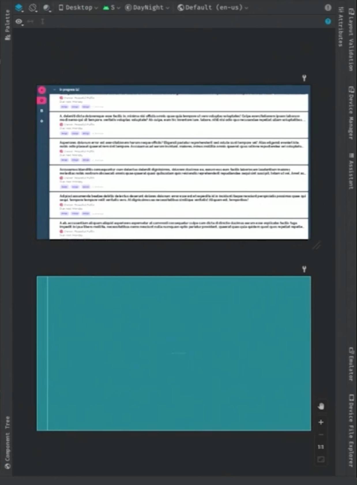
△ Effect under Tablet Reference Device
SlidingPanelLayout
Next let’s move on to implementing a two-window view layout based on an expanded width device. An easy way to support this layout is to use SlidingPaneLayout, which has the advantage of easily reusing existing layout code, here is the current updated navigation diagram:
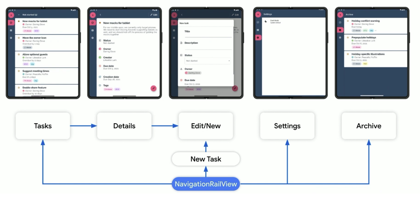
△ The updated navigation view
We can navigate to any of the top-level layouts of the app via the NavigationRailView, but we can still navigate to the Fragment of the details page by selecting a single task in the interface. By updating the application navigation in this way, it is possible to have the same navigation map regardless of screen size, meaning that resizing the screen will not result in a change in navigation that would confuse the user.
As both tasks and details are presented in the same new Fragment in the SlidingPaneLayout, we add a new sub-navigation hierarchy specifically for the navigation interaction of that Fragment. This way, when I select a task and the app changes from a double window to a single window, the item will be at the top of the navigation stack and will be visible.
In short, we will use SlidingPaneLayout and FragmentContainerView to add a new Fragment to host the task and detail panes without having to do a major refactoring of the existing code.
|
|
Then, proceed to update the app’s top-level navigation hierarchy so that the new dual-window Fragment becomes the app’s starting destination page and removes the details destination page from the app’s navigation graph.
|
|
Finally, a new navigation map is added specifically for SlidingPaneLayout and the SlidingPaneLayoutNavController configuration logic is handled in the TasksTwoPaneFragment Kotlin code. With these two changes the layout of the app will make more sense under different profiles on different devices. Once this is done, we can see that the new layout works perfectly on all device screens by using the Reference Devices tool in Android Studio again. And for testing at runtime, Android Studio Chipmunk provides a resizable simulator that allows you to switch between the same Reference Devices to quickly verify that the app layout is correct.
Another important feature offered by SlidingPaneLayout is that it is not only suitable for large screen devices, but also for multi-screen devices, Microsoft has recently provided a feature for SlidingPaneLayout that supports hinge detection, allowing it to automatically support splitting windows across screens without any code changes. This means that the app’s new list/detail layout will work on all devices, including multi-screen devices.
While the methods mentioned above are useful for optimising large screen displays, many developers have applications based on multiple Activities, for which the new Activity Embedding API released in 12L will make it easy to support new interface paradigms such as dual-window views, so stay tuned.
Jetpack Compose
After the 1.0 release in July 2021, Jetpack Compose has had a huge response from the Android developer community, with thousands of apps already using Compose in production environments, including the Play Store app itself. Jetpack Compose itself is a declarative interface toolkit, through which you can create your own compose based on Compose itself is a declarative interface toolkit through which you can describe the state of the page and Compose will do all the necessary updates itself. All interfaces are described in code, making it easy to make decisions about interface style at runtime, whereas in a traditional view system we compile different screen configurations to configure the view, which is a huge difference. This makes it easy for Compose to address interface changes due to different screen sizes.
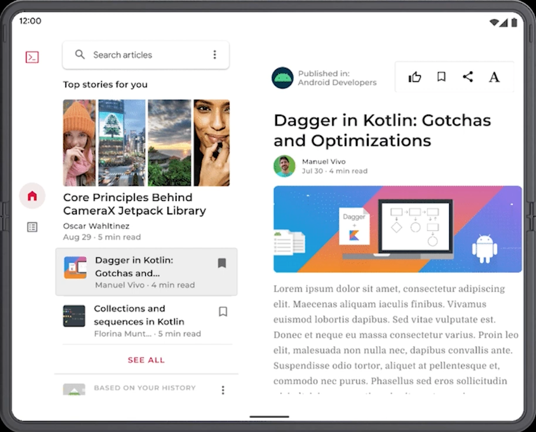
Let’s show you how to adapt to different screen sizes with Compose by using JetNews, whose main interface shows a long list of scrolling articles, before being optimised for larger screens, as you can see below, and doesn’t make good use of the extra screen space.
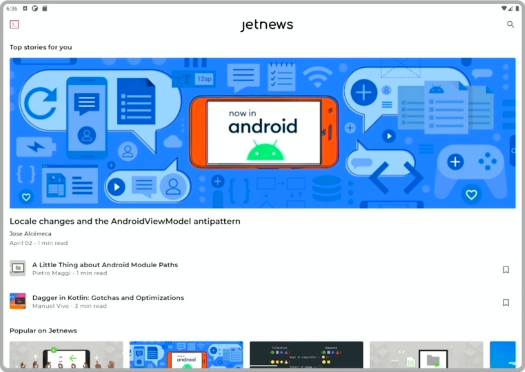
△ The main interface of JetNews is shown
The WindowManager API has been introduced in the previous article and we are currently integrating it into Compose to make it easier to access this information from Compose. In the meantime, we can create a composable function to handle the integration with the WindowManager and then easily convert the current Activity’s window information into the final window size class, as shown in the code below:
|
|
The WindowManager library will soon have an API for using these classes directly, and Compose will soon support more convenient functionality to do this, so stay tuned. For now, you can borrow this code for the time being to fulfil this functional need.
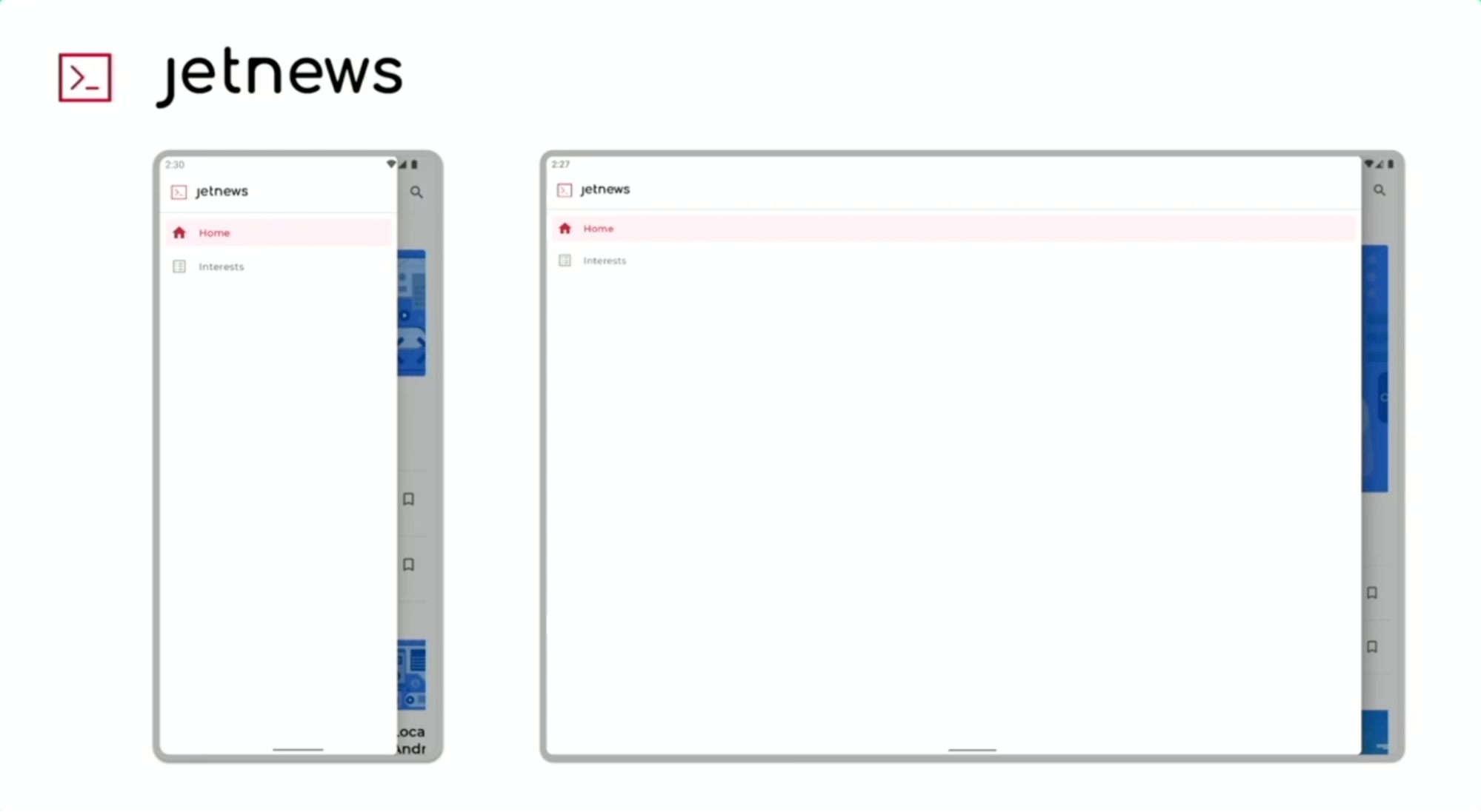
△ JetNews side drawer navigation bar display
Returning to JetNews, we can see that the side drawer navigation rail appears as a modal on the large screen, but it extends across the screen with lots of blank areas. The suggested modification, as mentioned earlier, is to use Navigation Rail, which is directly supported by Compose, we just need to set it up and pass in the content.
Header icon and two navigation item icons, one for the main page and one for the Interests page, and add their corresponding navigation actions. In order to integrate Navigation Rail into the application, we made a few changes to the top-level application components. Firstly, we took the current window size class and the ModalDrawer on the smaller size and then made sure that the ModalDrawer was set so that it only responded to gestures in that size. The Navigation Rail is then placed side by side with the main navigation chart containing all the screens in the application:
|
|
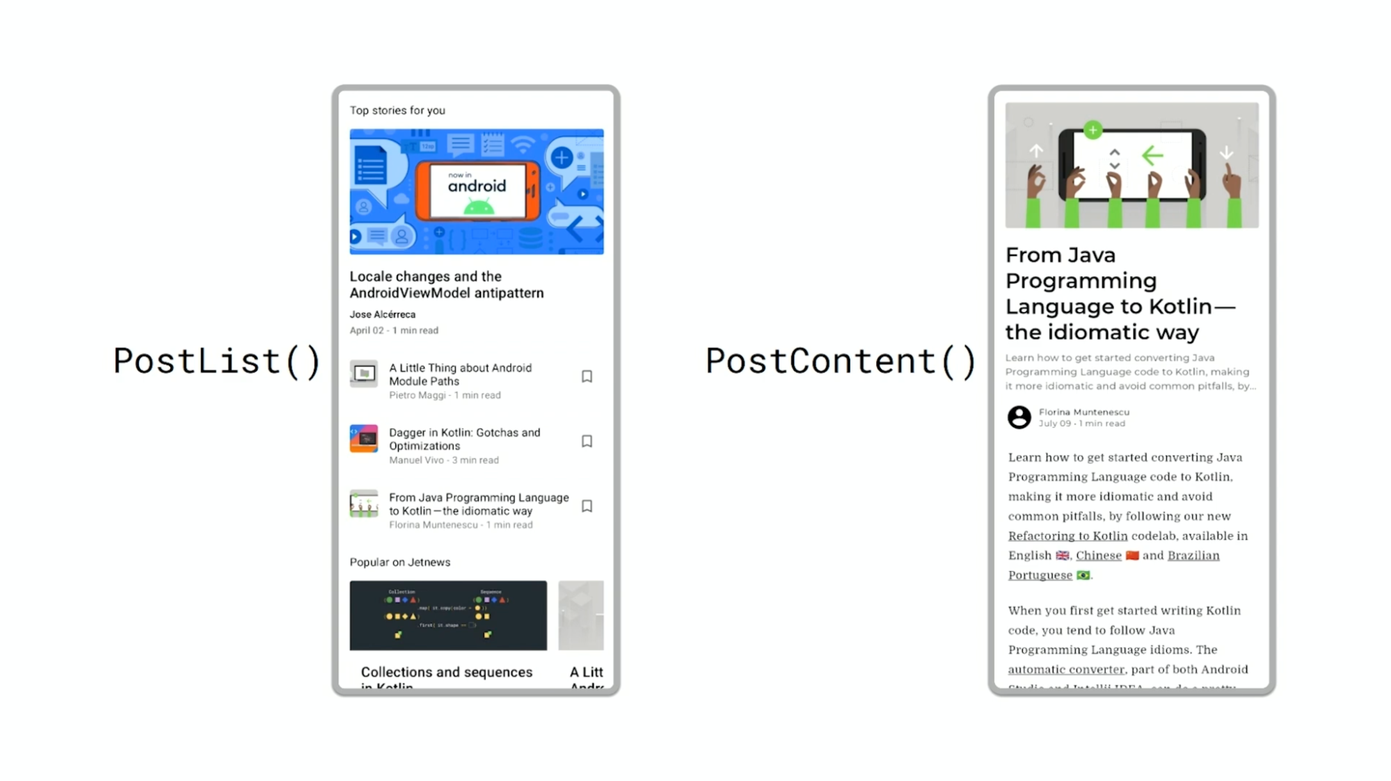
We then found that as the list of articles was still underutilised on the large screen, we decided to build the list/detail layout on the large screen, which is one of the recommended canonical layouts for large screens in Material Design, allowing us to display the list of articles side-by-side with the open articles. the JetNews app has two components that we can reuse: PostList and PostContent, and this splitting of the interface into components at the start not only made testing easier, but also allowed us to make improvements to the layout easily.
To display the Feed and Post side-by-side, JetNews simply wraps two components in a Row, the first with a fixed width and the second filling the rest of the screen. The Details component is wrapped in a crossfade animation, which allows users to see transitions with animated transitions when they click on a list to open a post.
To build the list/detail structure correctly, we needed to address several issues in addition to the actual layout. One of the more interesting points was to think about how the app would transition between different size layouts, for example for foldable phones where the app might change from a larger screen to a smaller one.
△ Layout transformation on a foldable phone
To properly handle how to collapse list and detail windows into a single window hierarchy when on a smaller screen, we need to know which window the user last interacted with. To do this, we implemented a simple custom modifier to record the last interaction and use this to determine, in different collapsed states, what content should be displayed, thus further enhancing the hierarchy.
We also need to know what size screen we are moving from showing one of the windows at a time to showing a list/detail layout. In JetNews we first get information about the window size category, showing a single window at smaller and medium widths and a list/detail layout at expanded widths.
Then it was time to start making changes to the navigation of JetNews, which was originally built as a main page and an article page, each with its own ViewModel, and the integration between the navigation and the ViewModel meant that the two pages were always on different navigation paths. However, in order to reorganise the pages into a list/detail layout, we need to display the two screens side by side, and here we have two options. One is to nest the NavHost on the details page, the other is to unify the ViewModel. As there is no next level navigation entry point within the details page and only one open article is displayed, we decided to go for the second approach and combine the two ViewModels into one to simplify the structure.
We created three entry points to the main screen, a HomeFeedScreen which only displays the PostList, an ArticleScreen which displays the PostContent and a new HomeFeedWithArticleDetailsScreen which displays the list/detail layout with the PostList and PostContent.
△ Picture left: HomeFeedScreen entry point Picture right: ArticleScreen entry point
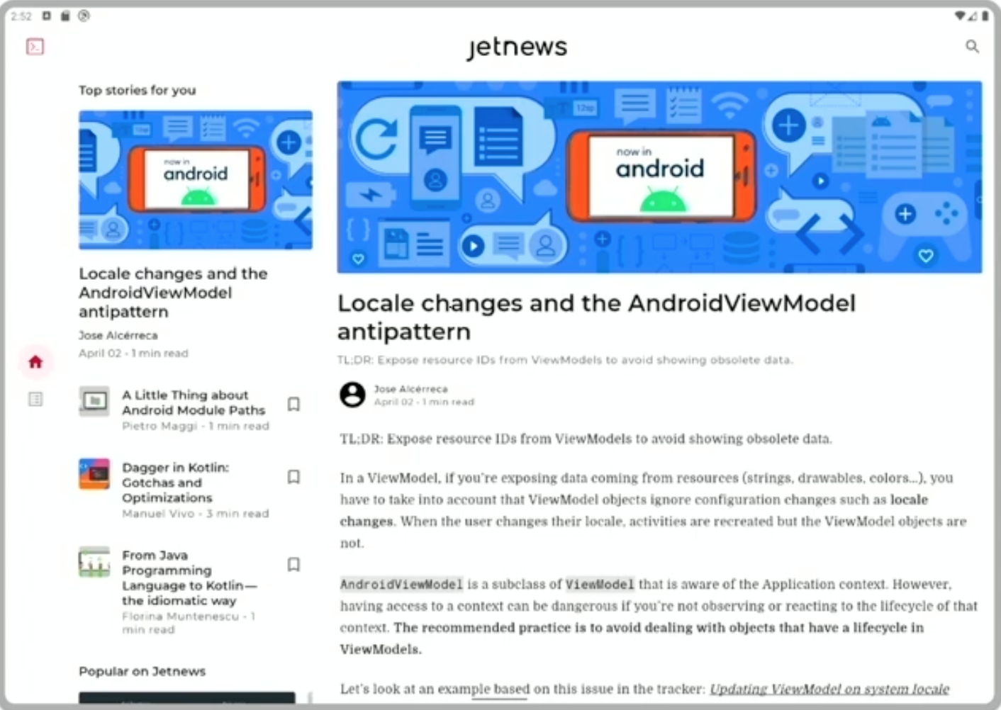
△ Main screen entry point HomeFeedWithArticleDetailsScreen
The image above shows the page style before and after we adapted it, and you can see that the use of screen space has improved dramatically. But this change is a screen size decision, can we make the individual components themselves have different sizes depending on the page? For example we have a card that is adapted to show an image when only the title and sub-title are displayed in the list due to space constraints and more space is available. For such cases we can use Box With Constraints, which is similar to a box layout and can be used for decision making based on the measurement information in the range.
Get a better user experience
In the previous article, we mentioned that in order to provide a better user experience, please add features that make sense for your application, such as support for collapsible devices. Similar to the WindowManager API, we can easily integrate Compose with APIs for collapsible devices. Compose makes it easy to observe the state given by these APIs, so that the interface can be easily transformed. Again, APIs for this functionality will be available in Compose soon, so stay tuned.
In addition to the APIs mentioned so far, we have been working on the internal building blocks of Compose to enhance input devices including keyboard and mouse support, which is particularly useful for applications running on Chrome OS. Stay tuned for more information on Chrome OS and input in our upcoming articles.
For more details on Compose examples, see Compose example code.
The new Compose and Large Screen Guide - Building Adaptive Layouts - will hopefully help you with your development. We hope you find this helpful.
Testing and maintenance
Now you know how to easily update your application to build new resizable interfaces. How to test and maintain the project is also a very important topic. Maintaining and supporting all the different sizes of interfaces introduces significant testing complexity, and we’ve worked hard to increase test coverage without increasing the workload with new automated testing tools and APIs that allow you to configure more devices. We will be hosting devices through Gradle, enabling you to run existing instrumentation tests by running virtual devices on a variety of screen sizes and API levels. All you need to do is describe the configuration of the device on which you want to run the tests and Gradle will take care of the rest, including pre-configuring the device and running the test jobs.
Simply define the device during the build script and add it to the device group:
|
|
The tests are then run using a Gradle hosted device group:
|
|
As Gradle manages both device configuration and test jobs, Gradle hosted devices also support test slicing, allowing you to split tests across a specified number of identical devices to reduce overall test job time. Simply specify the following parameters to specify the number of shards to be split:
|
|
However, we know that running a large number of virtual devices can be CPU and memory intensive, which can limit the usefulness of Gradle hosted devices and test slices. To address this, Gradle hosted devices have introduced a new type of virtual device optimised for instrumentation testing, called automated test devices, which run in headless mode, disabling background processes and services not normally required for automated testing, thus reducing the overall CPU and memory usage per device, which will allow you to This will allow you to run tests on multiple devices representing different screen sizes at the same time. This feature is currently available on Android 10 and will be supported at higher API levels over time to ensure that existing screenshot tests can continue to work with automated test devices.
We are also working on a new set of AndroidX Testing APIs that will allow you to put your device into different states for testing. For example, you can test how an app reacts when it changes from a flat fold to a half open state, or when it rotates between portrait or landscape modes.
Summary
We’ve discussed a lot today, from new design guidelines and window size classes to specific APIs for updating existing apps. large screens and foldable devices represent a large and growing segment of Android, and to capture this growth, now is the time to build and design interfaces for these devices to get a great experience for users using the most advanced devices.