I first learned about the concept of Web Components in 2019 and only recently started trying to use it, this will be a brief introduction to Web Components, understanding its standards, what problems it solves and its advantages, the interface API it provides, the level of compatibility This article will briefly introduce Web Components, learn about its standard, what problems it solves and its advantages, the interface API it provides, its compatibility level, how to write a simple component using it, etc.
What is Web Components
With the popularity of front-end frameworks, component-based development has become the norm. We usually extract modules with common functionality and encapsulate them into a single component, which makes it easier to use and maintain. But components are also limited by the framework, for example, once you leave the framework itself, components can not be used, then there is no framework across the range of technology to build a common component? Yes, there is, and that is the protagonist of today’s introduction of Web Components.
Web components are a set of web platform APIs that allow you to create new custom, reusable, encapsulated HTML tags to use in web pages and web apps.
In general Web Components is “encapsulating a component in a standardized and non-intrusive way”. The concept of Web Components was first introduced by Alex Russell at the Fronteers conference in 2011, and in 2013 Google released the Polymer framework, an implementation based on the Web Components API, to drive Web Components standardization. In 2014, Chrome released an early v0-level component specification, which has been updated to v1 and is now accepted and supported by major browsers.
Features
- standardization w3c is also constantly working on web standards specifications, including Web Components, this API specification has become a standard supported by most browsers, we will be able to develop more common components, do not have to spend time on the choice of framework, but more focused on the components themselves, through HTML, CSS, JS to build native components will become the future of front-end standard.
- Non-intrusive intrusiveness means that the design of the component is too strongly coupled, and the introduction of the component causes other code or design to make corresponding changes to accommodate the new component, while non-intrusive components do not have too many dependencies and are easy to migrate to other places. web Components components can organize their HTML structure, CSS styles, JS code well, and do not interfere with Web Components are well organized with their own HTML structure, CSS styles, and JS code and do not interfere with other code on the page.
- Web Components can be used with any JavaScript library or framework that interacts with HTML, and can be created through the browser’s API without the need to introduce third-party libraries or frameworks.
API
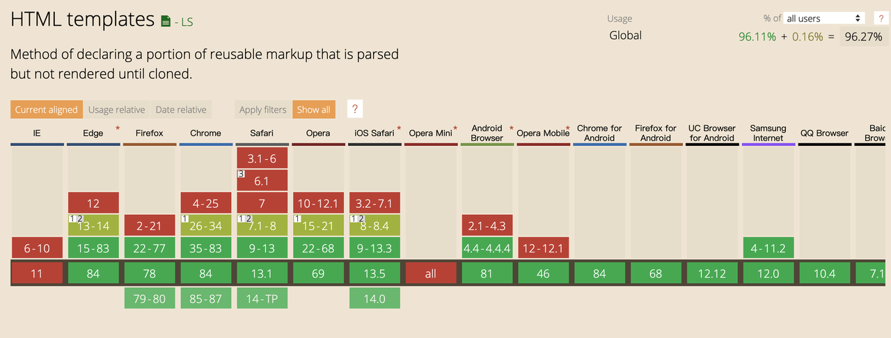
- HTML templates
The template technology introduces two important elements, template and slot, which provide the template functionality and slot is used to provide a placeholder hao to make the template more flexible.
The template tag is essentially the same as the HTML built-in tag, but until the template tag is activated.
- the tag will not be rendered and the content of the tag will be hidden, so the tag will not be visible on the page
- The content of the template will not have side effects, for example, scripts in the script tag will not be executed, images will not be loaded, and Video will not be played.
- basically can be placed on any node, such as header, body, etc.; the easiest way to activate a template is to make a deep copy of its content and then insert it into the node, for example.
|
|
|
|
Examples of user information cards and slots.
|
|
|
|
-
Custom Elements
- Create custom HTML tags
- Create custom classes
- Using the lifecycle Methods method
Defining new element tags that can be parsed into HTML requires first declaring a class that inherits from the HTMLElement class so that it can use some of the component’s lifecycle callback functions that help us enhance the component’s capabilities. To summarize the main points.
- The new custom class needs to inherit from HTMLElement
- The connectedCallback method is called when the element is mounted, and this in the code points to the custom element, so we can use this.innerHtml method to set the content in the custom element in this callback
- The problem with custom elements is that the style you define inside may affect the style of external dom elements, how to isolate inside, this is an api Shaodow DOM to be introduced below.
Life cycle callback functions.
- triggered when a connectedCallback element is inserted into the DOM
- disconnectedCallback is triggered when the element is removed from the DOM
- Triggered when the adoptedCallback is moved to a new document.
- Triggered when an attributeChangedCallback element is added, removed, updated, or replaced.
Execution order (here the attributeChangedCallback comes first because the configuration needs to be adjusted and should be done before inserting into the DOM).
Life cycle callback functions.
connectedCallback: triggered when the element is inserted into the DOMdisconnectedCallback: triggered when the element is removed from the DOMadoptedCallback: triggered when the element is moved to a new documentattributeChangedCallback: triggered when an element’s attribute is added, removed, updated, or replaced
Execution order (here attributeChangedCallback comes first because the configuration needs to be adjusted and should be done before the DOM is inserted).
|
|
An example of implementing a user-card with custom tags.
|
|
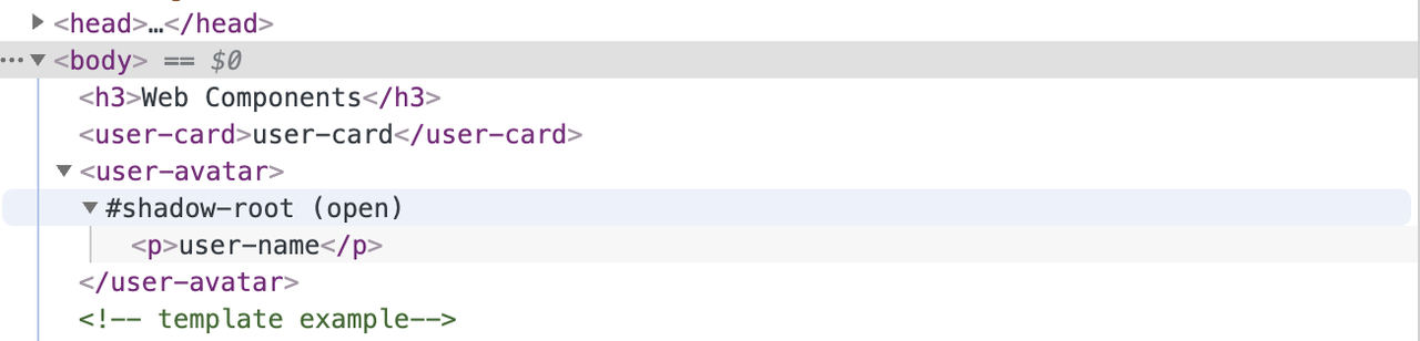
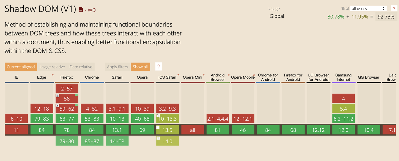
- Shadow DOM
Here the Shaodow DOM should not be confused with the commonly used frameworks in the Virtual DOM (Virtual DOM is mainly to do performance layer optimization), Shadow DOM allows us to create a set of completely independent of other elements of the DOM tree, also called “shadow DOM”, with the It ensures that the current component is a functionally independent component that does not interfere with other DOM elements. Similar to iframe, it is an independent sandbox, but it does not have its own window and has a lightweight document. In addition, the shadowRoot object does not support all DOM APIs and supports mainstream methods such as getElementById, querySelector and querySelectorAll.
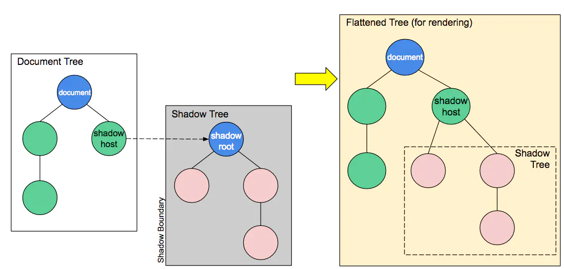
Structure.
- Shadow host: A regular DOM node to which the Shadow DOM will be attached.
- Shadow tree: The DOM tree inside the Shadow DOM.
- Shadow boundary: The place where the Shadow DOM ends and where the regular DOM begins.
- Shadow root: The root node of the Shadow tree.
The Element.attachShadow() method attaches the shadow DOM tree to a specific element and returns its ShadowRoot. this method has only one object type, a Key value mode, which can be set to open or closed to specify that the mode is open and closed. the open state means that the Shadow DOM can be accessed via The open state means that the Shadow DOM can be fetched via JavaScript, and the closed state shadowRoot will return null.
Example.
|
|
Not all HTML elements can be enabled for Shadow DOM, for example it does not make sense to use a non-container element like img as a Shadow Host and it will report an error. Currently supported elements: article, body, h1 ~ h6, header, p, aside, div, aside, nav, span, section, main, footer, blockquote.
Another standard HTML Imports (e.g. using <link rel="import" href="myfile.html >), which is deprecated and not detailed.
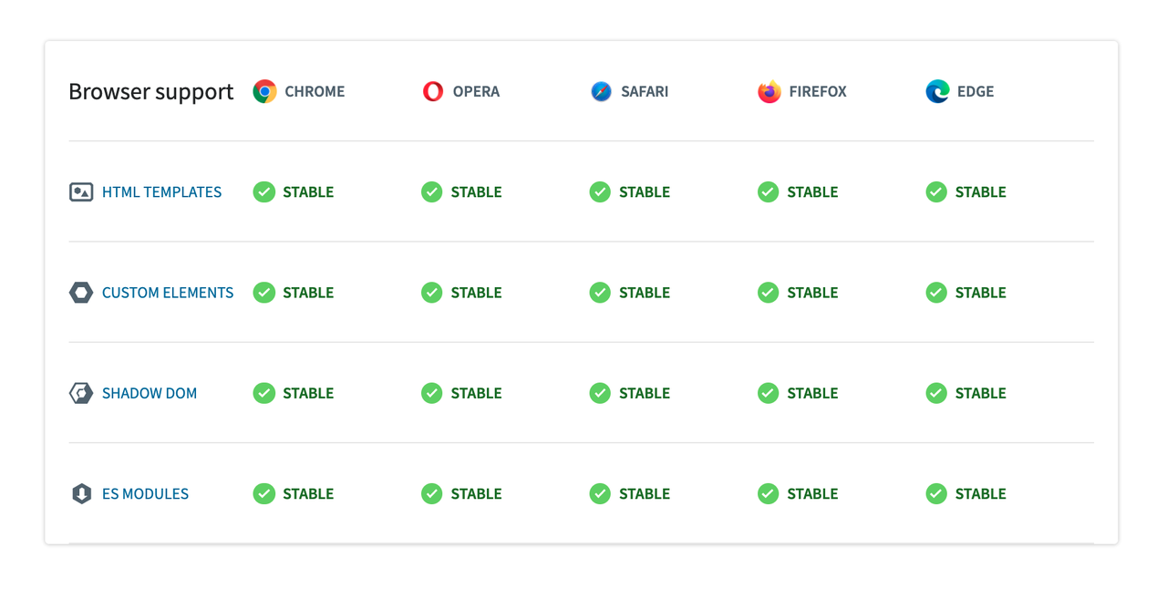
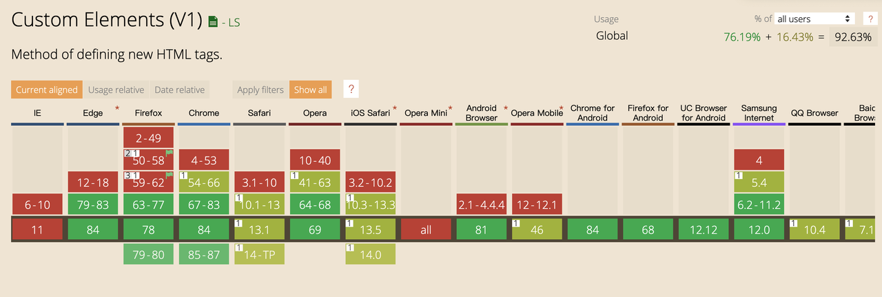
Compatibility
Safari started supporting Custom Elements and Shadow Dom in 2016, Firefox followed in 2017, and the APIs are now compatible as follows.
Other
- When defining custom tags using define, you cannot use a single word to force a short horizontal line to connect them in order to avoid conflicts with the original tags
- Custom element tags cannot be self-closing, because HTML only allows some elements to be self-closing.
- The style of the custom tag can be defined directly globally, or the style of the component should be wrapped with the code, e.g. define style in template
- Comparison with other current frameworks
- Web Component is a standard created by the W3C specifically for componentization , the API is also the underlying browser api , there is no cross-framework can not use the problem .
- And from the browser level to solve some of the scope of the problem , the use of Shadow DOM encapsulation style , and do not need to package the build can run directly on the browser , but also to achieve the JavaScript to write JavaScript , CSS to write CSS , HTML to write HTML , React is using JS to write CSS .
- standard support to promote progress is slow, proposed in 2013 v0 version, in 2016 to promote the v1 version, there are compatibility issues, the pit is still more
- The mainstream three major frameworks Vue, React, Angular support the use of Web components, there are also some libraries or tools to implement the framework components into a common Web components components, and for example hybird can be used to write Web components in a functional way
- Component pass listener and event binding.
- How to pass values and listen for changes in values
- Using DOM attributes, you can use getAttribute to get the value set by the component, and setAttribute to update the value of the component’s attributes.
- Also use observedAttributes and the lifecycle function attributeChangedCallback to update the value of the attribute.
- Event binding is relatively simple, just add event listeners directly in the custom tag, if you need to pass functions and internal trigger functions, listen to the binding click event to pass in the callback function, dispatchEvent in the custom component to trigger the click event
|
|