Nowadays, Atomic CSS is gaining more and more attention. Compared to the traditional CSS writing method where each component has one CSS class. With Atomic CSS, each CSS class uniquely corresponds to a separate CSS rule. As the number of components grows, more and more CSS rules can be reused. The final CSS product is much smaller, allowing for a quantum leap in page load speed.

History of CSS authoring methods
Before we introduce Atomic CSS, let’s review the evolution of how CSS is written.
SMACSS
SMACSS (Scalable & Modular Architecture for CSS), is a theory of CSS proposed by Jonathan Snook. Its main principles are 3.
- Categorizing CSS Rules (for CSS categorization)
- Naming Rules
- Minimizing the Depth of Applicability
Rules Classification
SMACSS classifies rules into five categories: Base, Layout, Module, State, and Theme.
Base rules hold the default styles. These default styles are basically element selectors, but can also contain attribute selectors, pseudo-class selectors, child selectors, and sibling selectors. Essentially, a base style defines how an element should look at any location on the page.
Layout rules split the page into sections, each of which may have one or more modules. As the name implies, this category is mainly used for the layout of the page as a whole or one of its areas. Modules are the reusable, modular parts of our design. Illustrations, sidebars, article lists, etc. are all modules. State rule defines how our module or layout should appear in a particular state. It may define how a module or layout should be displayed on different displays. It may also define how a module may look like on different pages (e.g. home page and inner page). Theme rules are similar to status rules and define the appearance of a module or layout. This is how many websites implement features such as “dark mode” and “switching themes”.
Naming Rules
After separating the rules into five categories, a naming convention is needed. Naming conventions make it easy to immediately know which category a style belongs to and what role it plays in the overall page. In a large project, we may split a style into several files, and naming conventions make it easier to know which file the style belongs to.
It is recommended to use prefixes to distinguish layout, module, state, etc. rules. For example, using the layout- prefix for layout rules and the is- prefix for state rules is a good choice.
Minimize adaptation depth
Try not to rely on the structure of the document tree to write styles. This will make our styles more flexible and easier to maintain.
BEM
BEM (Block Element Modifier) is a front-end CSS naming methodology proposed by the Yandex team. It is a simple yet very useful naming convention. It makes front-end code easier to read and understand, easier to collaborate with, easier to control, more robust and clear, and tighter.
The pattern of the BEM naming convention is as follows.
blockrepresents ablock, which is used for the component body.elementrepresents anelement(also called asub-component) of theblock, which is the main member of the block composition.modifierrepresents a modifier of the block, indicating different states and versions. The distinction is made using--for “blocks” and “elements”, which are called “block modifiers” and “element modifiers” respectively.
The reason why __ and -- are used to separate different parts of a name is that if more than one word appears in a part it needs to be separated by -, so as to avoid confusion.
CSS Modules
As the number of CSS class names in a large front-end project grows, it is inevitable that there will be class name conflicts, which is why CSS Modules were created - to prevent conflicts by adding hashes to CSS class names and so on to produce unique names.
CSS Modules is not an official CSS standard, nor is it a browser feature, but rather a way of scoping CSS class names and selectors using some build tools such as Webpack.
Utility-First CSS
At a time when most of the CSS methodologies used in traditional large-scale projects are the above-mentioned OOCSS, SMACSS, BEM, and other “semantic CSS” solutions that focus on “separation of concerns”, the Utility-First CSS concept is gaining attention from the community. The most well-known and typical of these is Tailwind CSS.
Instead of putting component styles in a class like Semantic CSS, Utility-First CSS provides us with a toolbox of different functional classes that we can mix together and apply to page elements. This has the following benefits.
- not having to get hung up on naming class names.
- the simpler the function of the class, the higher the reuse rate, which can reduce the final package size.
- No global style pollution issues.
- and so on.
However, there are some shortcomings.
- The content of the
classattribute is too long. - Problems related to the order of CSS rule insertion.
- the role of the component cannot be known by the semantic class name.
- The build product is too large without compression.
A new era is here - Atomic CSS-in-JS
Taking the Utility-First CSS introduced in the previous article a step further, Atomic CSS has come to the forefront.
The idea behind Atomic CSS is the opposite of the old “separation of concerns” idea. The use of Atomic CSS actually couples the structure and style layers in a way that is largely accepted in modern CSS-in-JS codebases, as described further below.
Atomic CSS can be seen as the ultimate abstract version of Utility-First CSS, where each CSS class corresponds to a single CSS rule. But with such a complex set of CSS rules, writing Atomic CSS class names by hand is not a good solution. So Atomic CSS-in-JS was born, which can be thought of as “Atomic CSS for automation”.
- eliminating the need to manually design CSS class names.
- the ability to extract the key CSS of a page and split the code.
- can solve the classic CSS rule insertion order problem.
Disadvantages of the traditional CSS writing approach
Christopher Chedeau has been working to promote the CSS-in-JS philosophy in the React ecosystem. In many of his talks, he has explained several of the major problems with CSS.
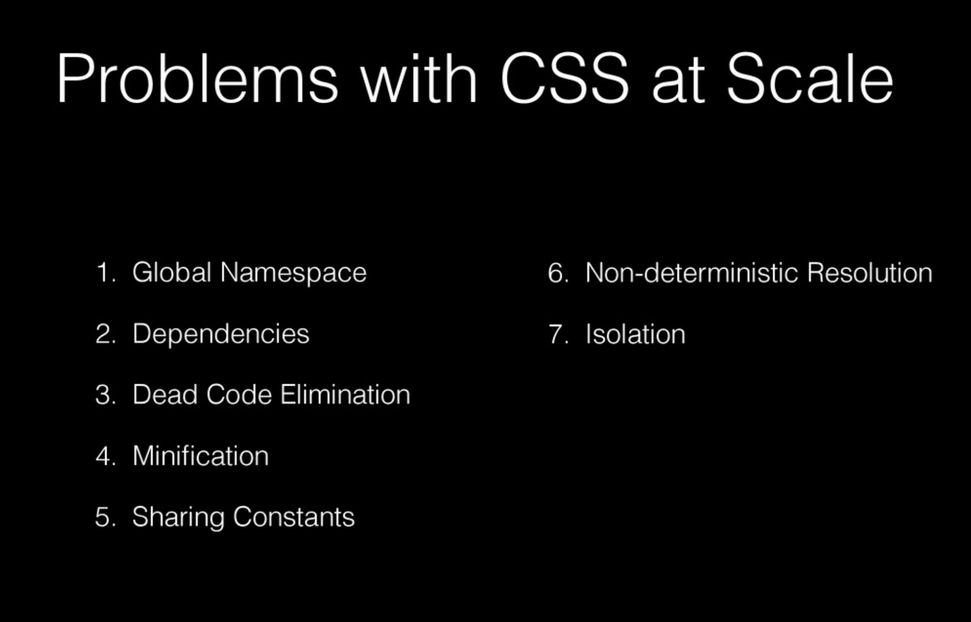
- global namespace
- dependencies
- Useless code elimination
- Code compression
- shared constants
- Non-Deterministic Parsing
- isolation
While Utility-First CSS and Atomic CSS solve some of these problems, they do not solve all of them (especially the non-deterministic parsing of styles).
As an example: Tailwind CSS generates a lot of useless code when it is generated, causing the style file to grow in size.
|
|
The generated style file looks like this.
You can see that this file contains a lot of useless code, such as the repeated content: var(--tw-content).
Smaller build product
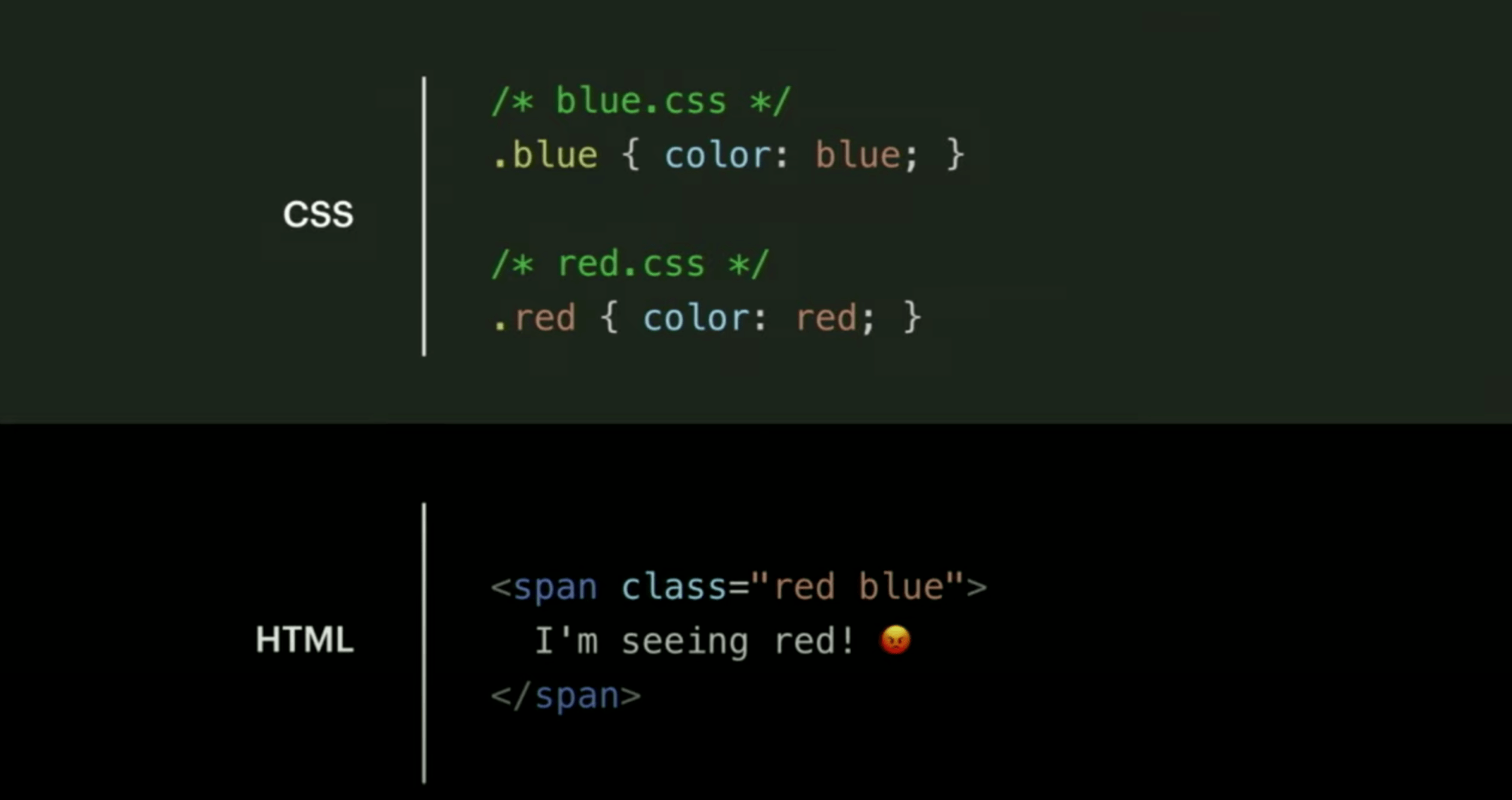
Traditional CSS writing methods cannot reuse CSS rules that are repeated between components, such as the several rules highlighted in the image below each lying in their corresponding CSS class.
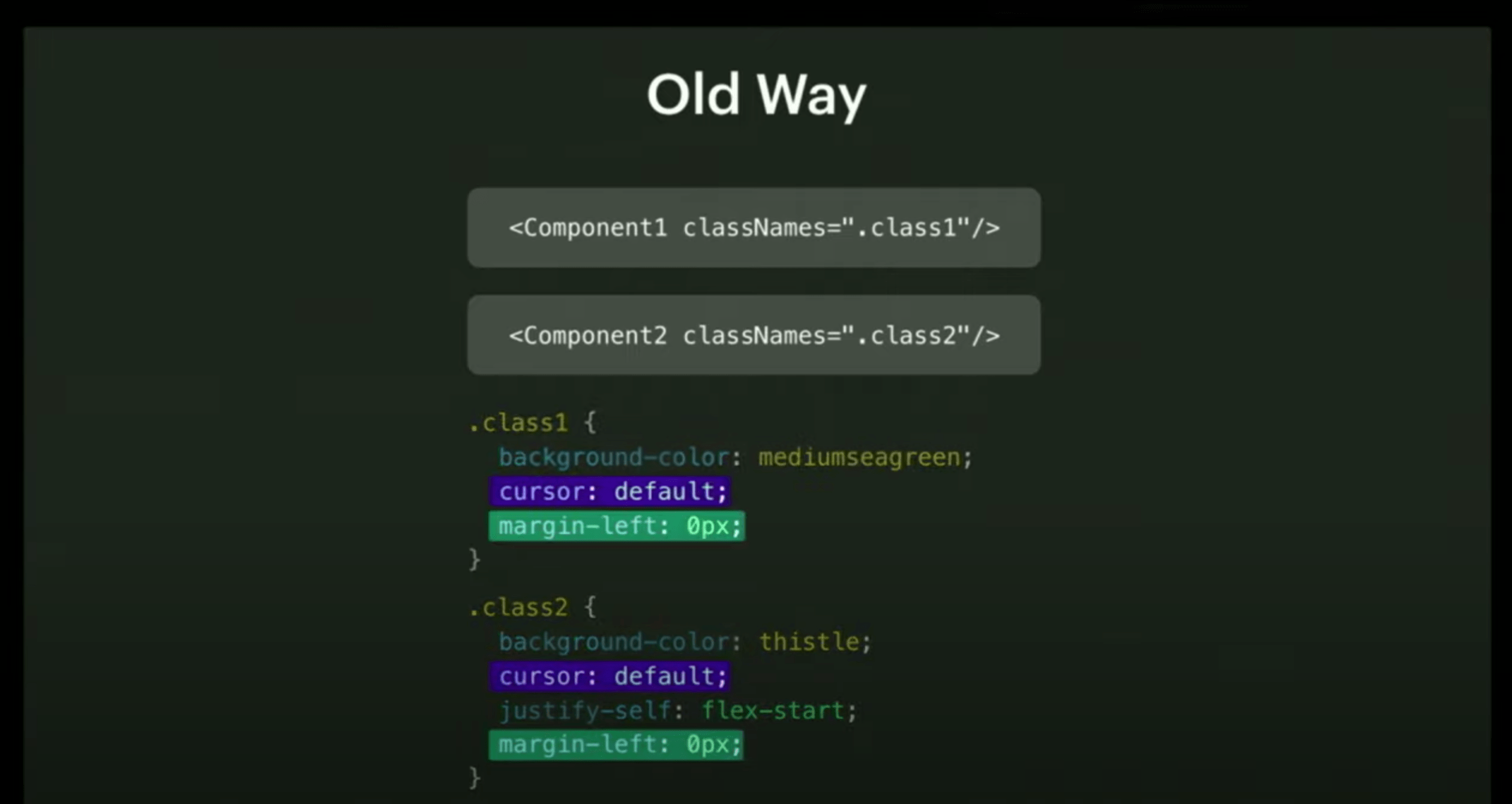
This results in a linear correlation between CSS product size and the complexity of the project and the number of components.
However, with Atomic CSS, these rules are extracted for reuse.
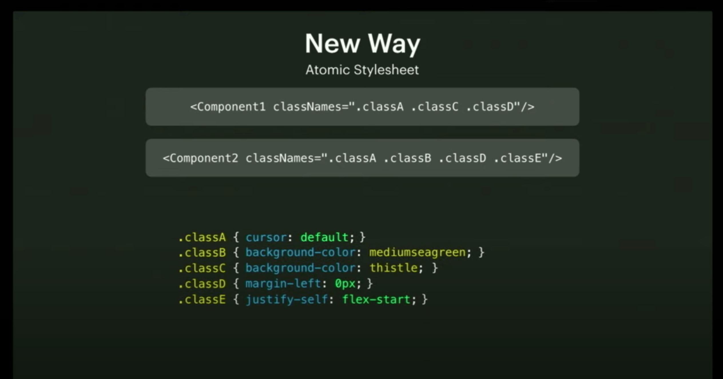
As the number of components increases later, more and more CSS rules can be reused, and the final CSS product size is logarithmically related to the complexity of the project.
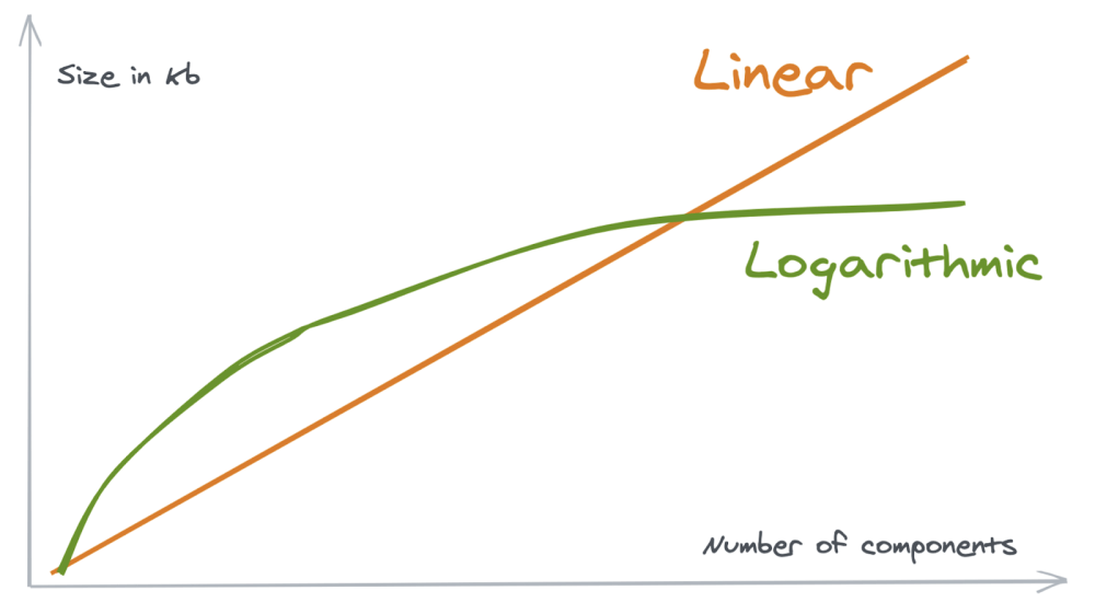
Facebook shared their data: on the old site, the login page alone required 413 KiB of style files to be loaded, while after rewriting with Atomic CSS-in-JS, the entire site only had 74 KiB of style files, including the dark color mode.
Although the size of the HTML is significantly larger with Atomic CSS, the high redundancy of these class names makes it possible to use gzip to compress a significant portion of the size.
Handling the insertion order of CSS rules
Let’s go over this classic CSS rule insertion order problem again.
We all know that the last style to take effect is not the rule corresponding to the last class name, but the last rule inserted in the stylesheet.
So, how can this be handled in CSS-in-JS? The common practice is to filter out conflicting rules at the generation stage to avoid conflicts. Take for example the following component.
The actual style of the filtered component is as follows.
|
|
If you switch the order of styles.card and styles.profileCard in the component style, the filtered style will look like this.
|
|
However, there are some shorthand rules in CSS that obviously won’t work if you just follow the rule names. Some libraries force developers not to use shorthand rules to avoid this problem, while others expand these shorthand rules into multiple rules and then filter them, for example margin: 10px can be split into margin-top: 10px, margin-right: 10px, margin-bottom: 10px and margin-left: 10px into four separate rules.
Classic implementations
Atomic CSS-in-JS implementations are available as Runtime and Pre-Compile. The advantage of Runtime is that it can dynamically generate styles, which is more flexible than the pre-compiled libraries below. The disadvantage is that operations such as Vendor Prefix need to be performed in Runtime, so the Bundle must carry the relevant dependencies, resulting in a larger size. The advantage of Pre-Compile is that the dependencies are not packaged and sent to the client, which improves performance. The disadvantage is that the precompilation process is highly dependent on static code analysis, so it is difficult to achieve dynamic style generation and combination.
Styletron
Styletron is a more typical runtime Atomic CSS-in-JS library developed by Uber that drives Uber’s website and H5 pages.
Styletron also provides a set of implementations of Styled Components, which can be used in the following ways.
It is also possible to dynamically generate styles based on the value of prop.
Fela
Joining Styletron as a runtime Atomic CSS-in-JS library is Fela, developed by the former technical director of Volvo Cars, which drives the Volvo Cars website, Cloudflare Dashboard and Medium, among many other sites.
vanilla-extract
Stylex is a precompiled Atomic CSS-in-JS library from Meta (formerly Facebook) that has not yet been open sourced. However, due to Meta’s delay in open sourcing stylex, several open source implementations based on its ideas have emerged in the community, with vanilla-extract being the best known.
style9
Pre-compiled Atomic CSS-in-JS libraries based on the stylex idea include style9 and styleQ in addition to vanilla-extract.
compiled
Moving away from the stylex family, Atlassian also writes a pre-compiled Atomic CSS-in-JS library called compiled. However, there are many pitfalls in my practical use, which may lead to duplicate style generation, and its support for TypeScript is not as good as it could be. However, there are many techniques in the code implementation that can be useful.
Styled Components
compiled relies on a babel transformer to transform the code to insert styles.
In the packages/react/src/styled/index.tsx, you can see that @compiled/react contains an object named styled that is exported and immediately throws an error when it is accessed, indicating that the transformer is not working properly .
Then you can see that styled will be replaced by transformer and the corresponding entry logic is in packages/babel-plugin/src/babel-plugin.tsx file.
|
|
This code documents the introduction of @compiled/react and facilitates the processing below.
|
|
The handling of TaggedTemplateExpression and CallExpression corresponds to the two different ways of calling in the documentation.
Follow the definition of the visitStyledPath function to find packages/babel-plugin/src/styled/index.tsx file.
|
|
Let’s look at the function extractStyledDataFromNode which extracts the style information using different methods depending on the situation.
|
|
The function to build a new node is defined in packages/babel-plugin/src/utils/ast-builders.tsx file.
|
|
As for the operation of constructing nodes, it is a simpler string splicing.
|
|
This goes around in circles, pulling out the style of the component generated using the styled method and turning it into a compiled Atomic CSS-in-JS component.
css Prop
compiled first adds TypeScript definition of css prop, and then specialize this prop in the babel transform as with the styled component.
The handling of css prop looks much simpler than the complicated handling of styled components.
|
|
The buildCompiledComponent function to build a new node is defined in packages/babel-plugin/src/utils/ast-builders.tsx file, this function mainly accomplishes the following operations.
- merges the existing
className. - process the styles in the
cssprop. - generate the compiled Atomic CSS-in-JS component.
This splits the component’s css parameter into two parts – the static style and the className parameter value that is appended to the original component.
Other
Microsoft’s recently open-sourced Griffel supports both runtime and pre-compiled modes, and has better TypeScript support, which is not a bad choice. This library currently drives Microsoft’s official Fluent UI.
Summary
That’s all there is to know about Atomic CSS in this article.
Although Atomic CSS-in-JS is a new trend in the React ecosystem, it is important to think twice before using it - whether it fits the needs of your project, rather than using it blindly and sowing future maintenance hazards, but if there are obvious benefits to using it, then Why not?