TypeScript officials have announced a new homepage for their website to better introduce users to TypeScript.
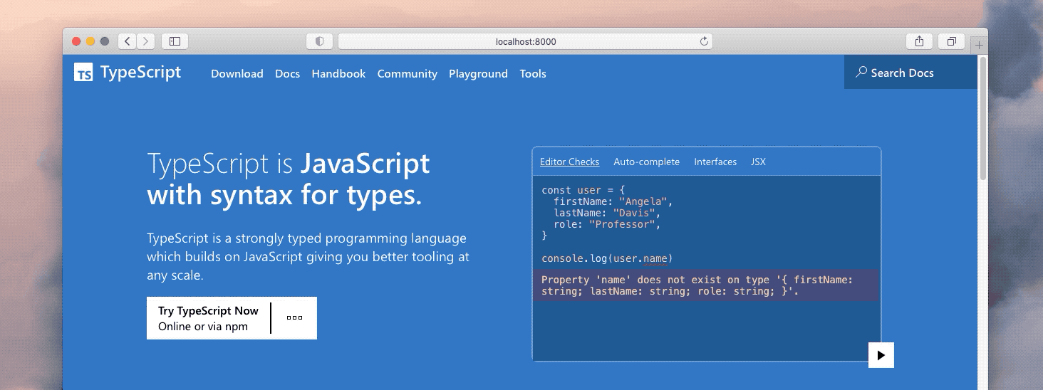
In the article, the official says that the previous homepage had a number of problems, such as no obvious call-to-action phrase at the top of the site, too much text explaining concepts, a lack of focus due to the visual weight between sections of the site, and not enough code examples. Finally, an A/B test was carried out with users of the site to see if any new users liked the homepage, but the results were essentially 50/50. As a result the new homepage has undergone the following changes.
- Reduced the amount of text on the page and each section now has bolded key information.
- Restricted the colour palette to blue from the TypeScript logo and shades of white and black.
- Created an intermediate navigation point to make it easier for users to jump between documents, editors or tutorials.
- Replaced the footer content with a jump point at the end of the page, using the same links, but adapted the design to fit the footer.
- Started to focus on the developer experience with TypeScript.
As with the previous homepage, the new homepage has passed regular accessibility audits, can be used with JavaScript disabled, and can be navigated entirely via the keyboard. Interested users can go to experience.