Google has recently released the latest version of Chrome Canary, in which Chrome has a “brand new” logo, which is the fourth version of Chrome’s logo since its birth in 2008.
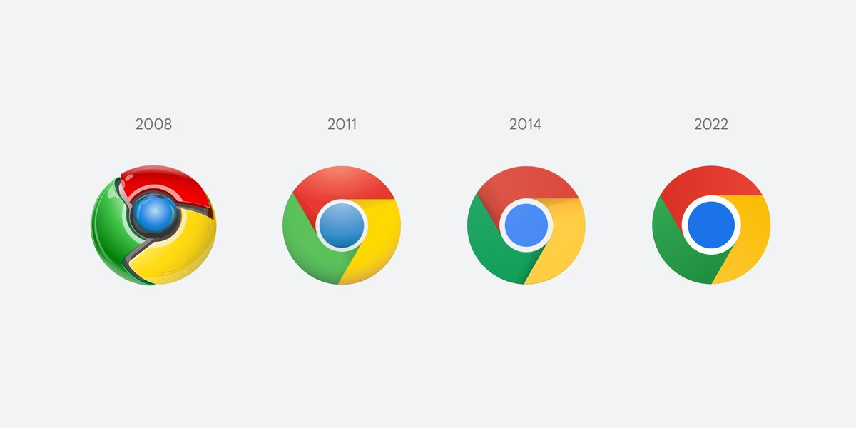
Although this is a “new” logo for Chrome in 8 years, you can see that the changes are not too drastic. Even at first glance, you can hardly tell what has changed.
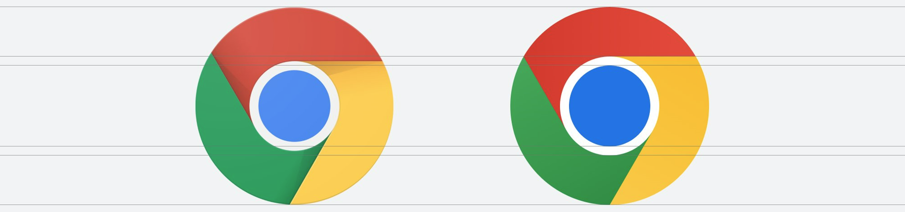
So let’s take a look at some of the design details and see what’s different between the new version and the old one. Here is a comparison chart.
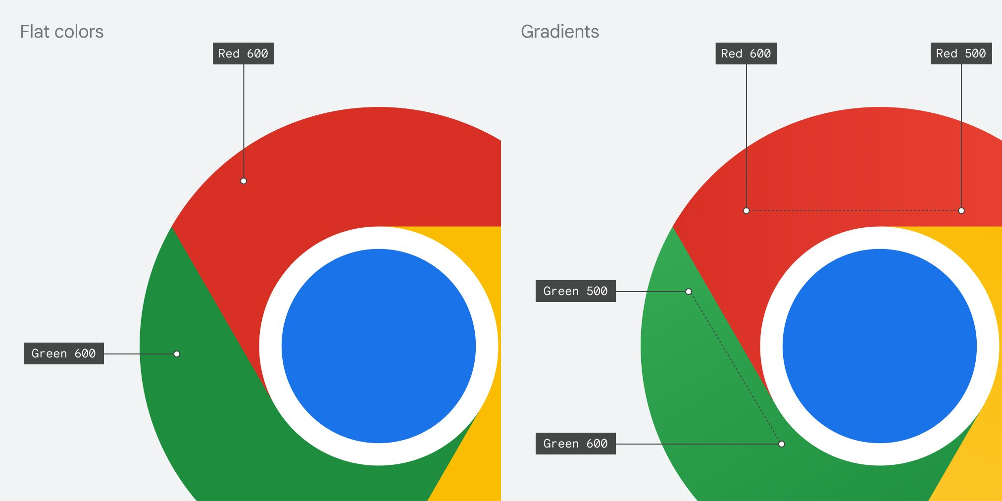
According to claim by Google designer Elvin Hu, the following are the design changes in the new logo.
-
Where red-yellow, yellow-green and green-red meet, the icon has been simplified/flattened by removing the shadow at the junction
-
The four colors - red, yellow, green and blue - have been made brighter so that the Logo becomes more prominent in the screen.
-
The ratio of the outer and inner circles is different, and the middle blue circle is significantly larger in the new version.
-
There is a slight gradient transition in color (the gradient is not even noticeable to the human eye without throwing in a PS comparison)
In addition to the above changes, Google will actually create slightly different logos for different operating systems to better blend with the different design philosophies that the systems have with each other. According to Google designer Elvin, on Windows, Chrome will have a more pronounced gradient to match the design of the operating system.
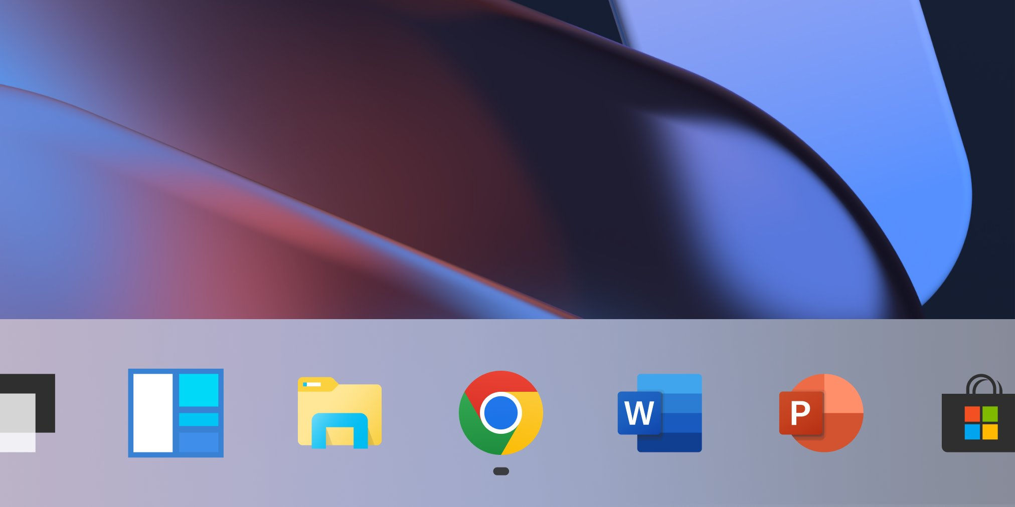
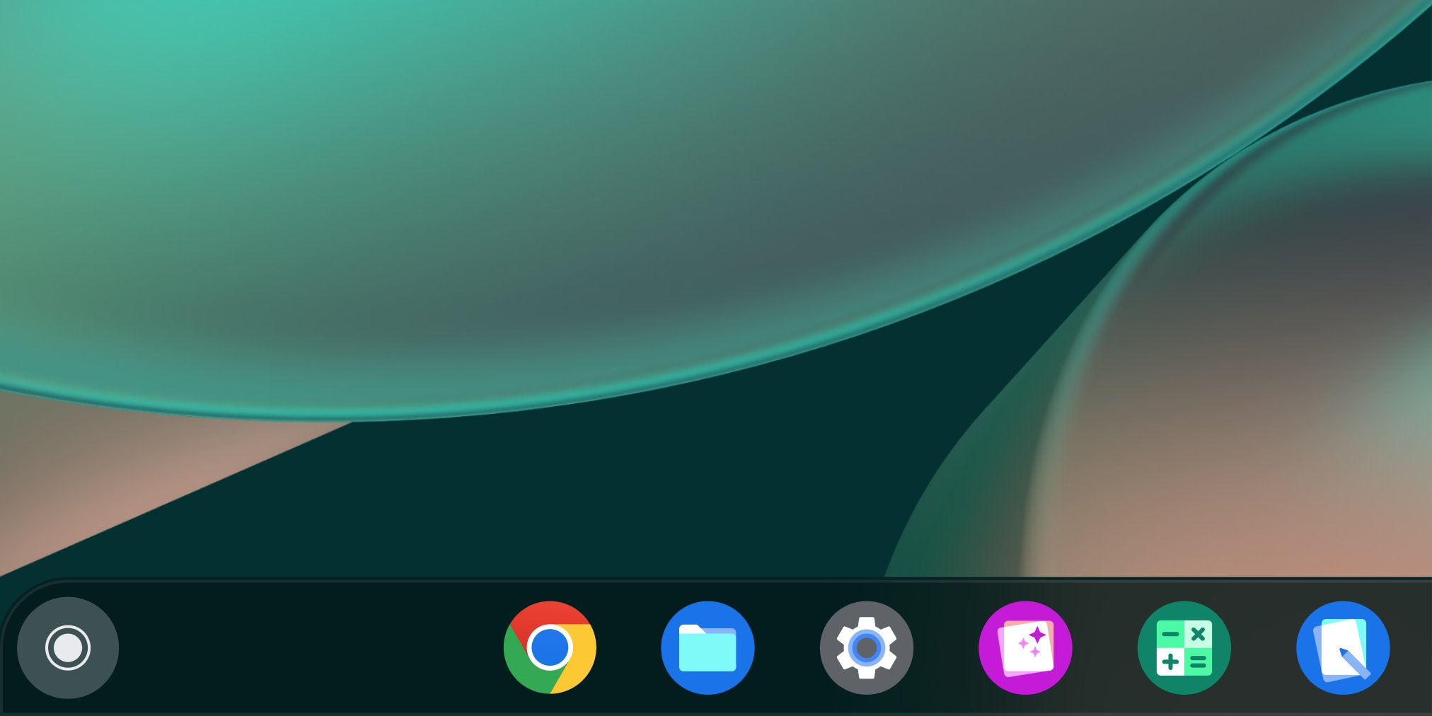
On Chrome OS, Chrome will use brighter colors and will not use gradients.
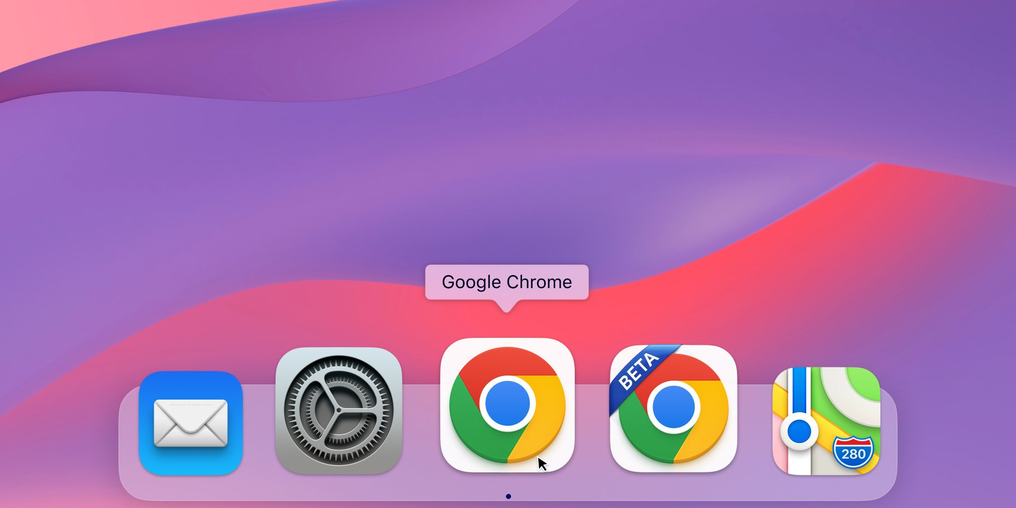
The macOS version will have a slightly 3D icon (note the three-dimensional effect on the bottom side of the logo) that somehow matches Apple’s native system icon. For unstable versions such as “Beta” and “Dev”, a banner with the corresponding wording will be displayed in the upper left corner.
From 2008 to now, Chrome’s logo has become simpler and simpler. Overall, the new logo is one that you probably wouldn’t have noticed if you hadn’t been told.
Of course, a small change isn’t a bad thing - after all, the Chrome logo is so iconic and recognizable that you’ll know it’s Chrome the first time you see it. The new logo will be rolled out across platforms and versions.